
UX CASE STUDY for MIRA APP
Problem
The modern digital age has made it increasingly easy to get distracted and overwhelmed, leaving little time for intentional self-care. Overworked and stressed individuals need a simple everyday tool for simple practices that will help them to relax, destress and feel better about themselves.
Solution
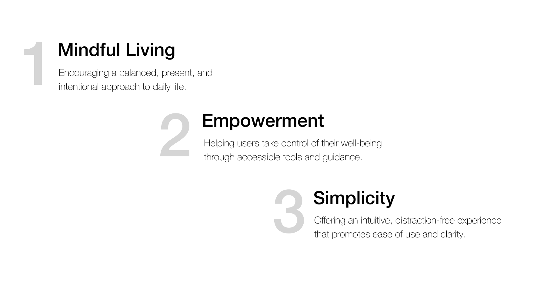
MIRA app is designed to provide users with simple, enjoyable tools to cultivate a daily self-care routine. By integrating mindfulness, and gratitude into their lives, stressed and overwhelmed users can build healthy habits, feel better about themselves, and develop a deeper connection with their well-being.
Everyday activities to improve relaxation and help users unwind and reflect on emotional well-being.
Reminders to bring users back to use simple and enjoyable tools as an alternative to scrolling social media.
Community support and connection for understanding and supporting users with compassion and kindness.
Users
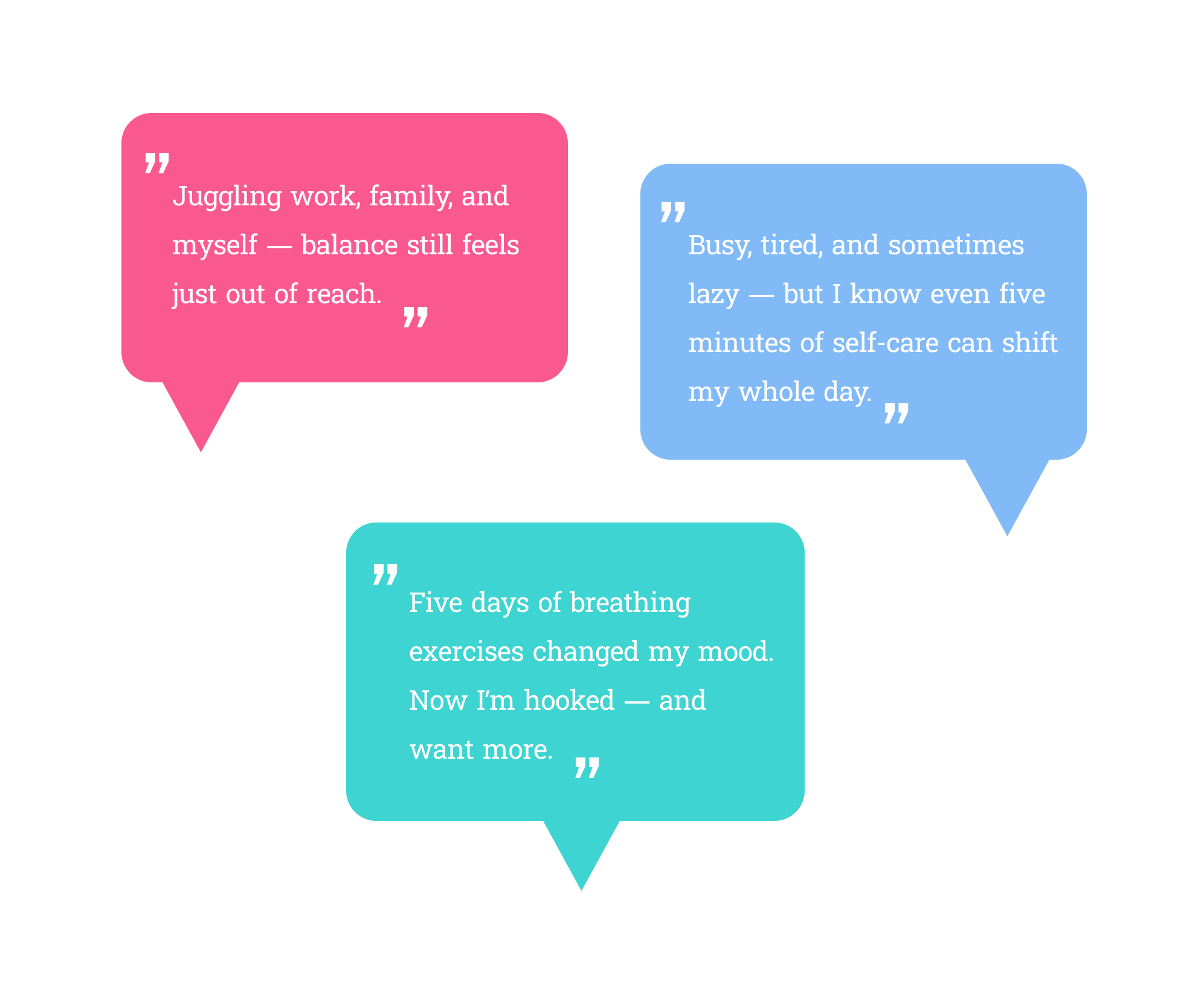
User Interviews ➡️ 10 interviews were conducted with potential users from diverse backgrounds and age groups to uncover real-life pain points and challenges they face when using similar apps.
Affinity Maps ➡️ The responses were analyzed and organized into key categories, including the need for structure, preferred self-care practices and resources, time availability, and desired features.
Gaining Insights ➡️ The findings were synthesized into actionable insights to guide the next phase of design.
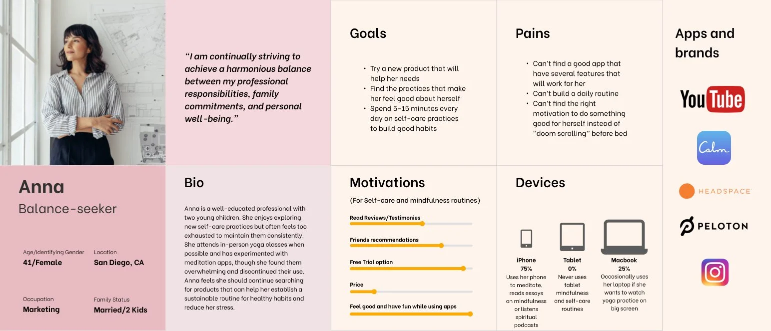
Personas
The interviews with users allowed me to get to see their deeper interest in the topic, understand their frustrations and motives for using specific features. Using the findings from my interviews I created 2 user personas that highlighted key struggle points and goals.
Competitors
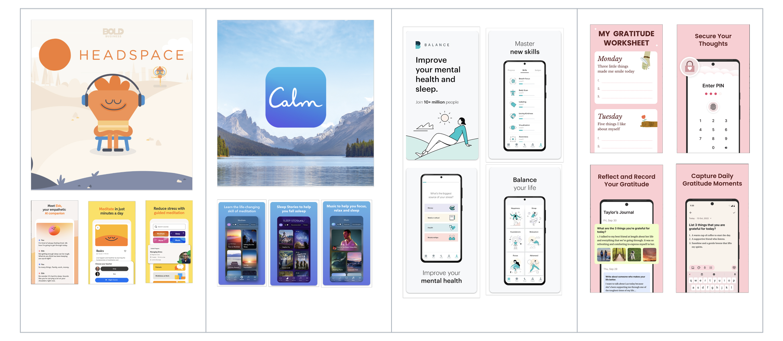
I analyzed popular self-care and mindfulness apps to identify both best practices and gaps in the market that MIRA could fill.
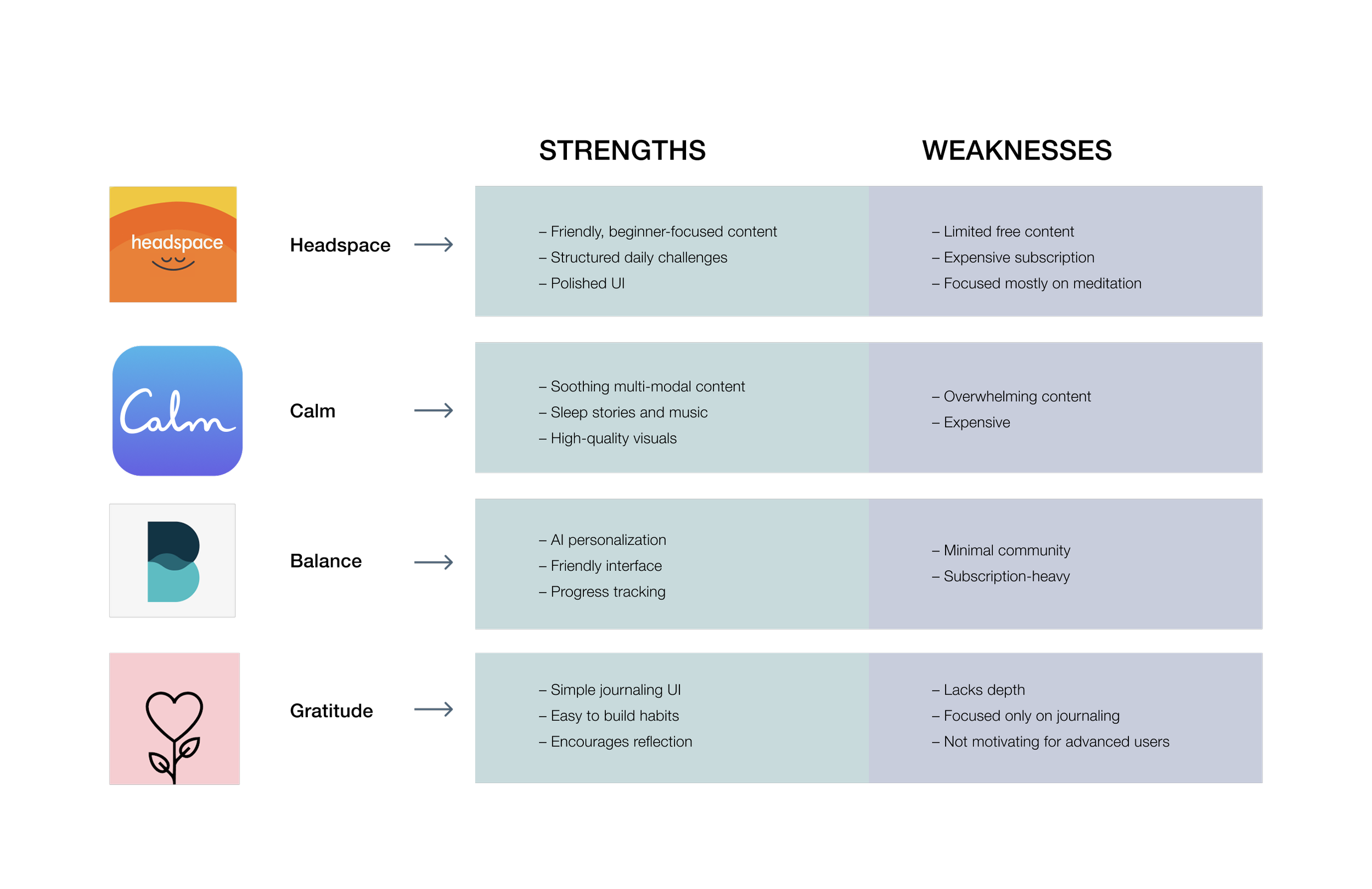
Key Takeaways
‣ Most apps focus on one dimension of wellness.
‣ Users dislike aggressive upselling — want more free content.
‣ Designs are often cluttered, users feel overwhelmed with too many choices.
‣ Few apps foster true community or emotional honesty.
How MIRA stands out
⦿ Combines multiple, easy-to use self-care tools in one place.
⦿ Free features with room to grow.
⦿ Community built on kindness, not comparison.
⦿ Gentle, realistic tone — no “forced positivity”.
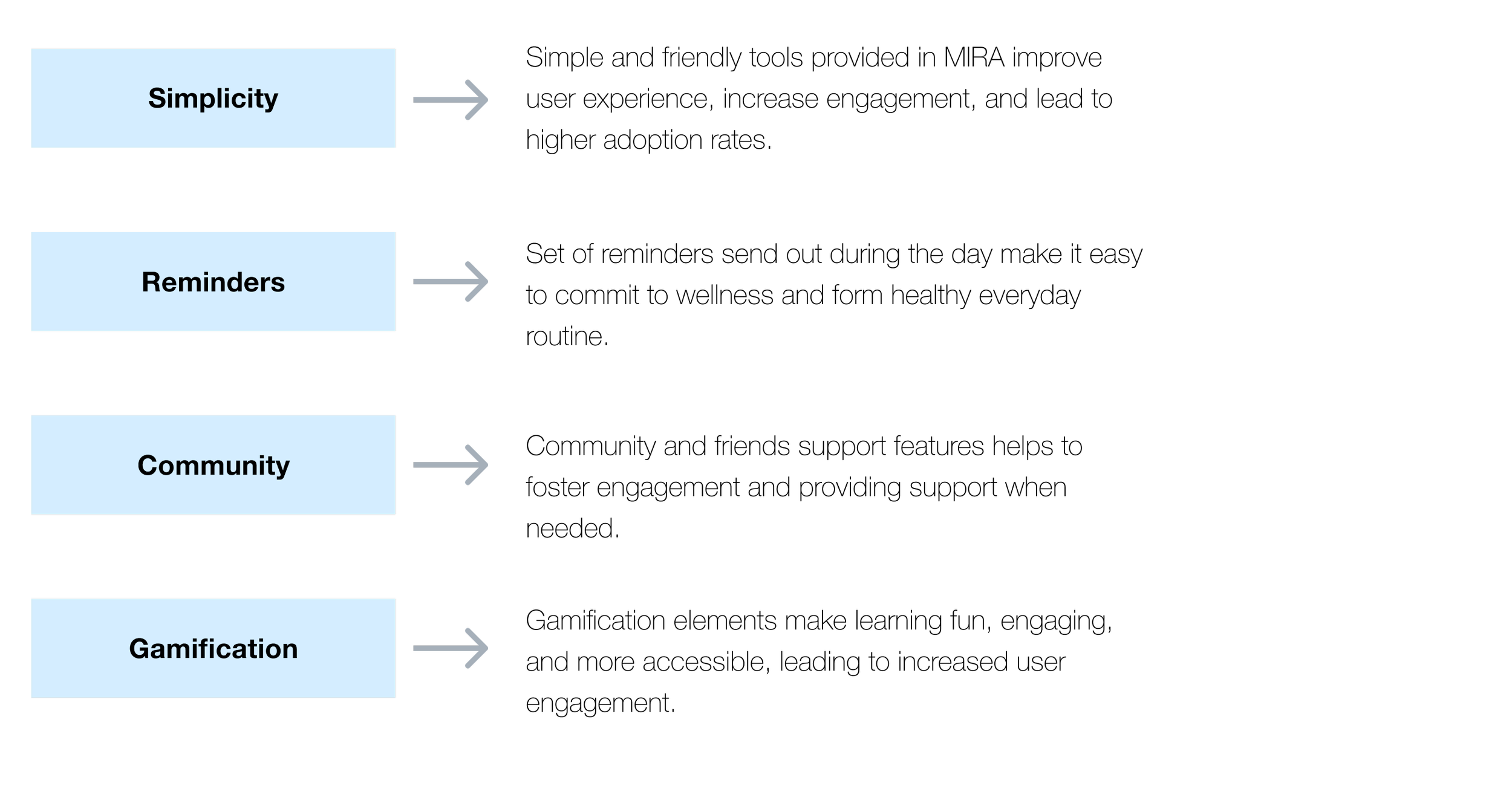
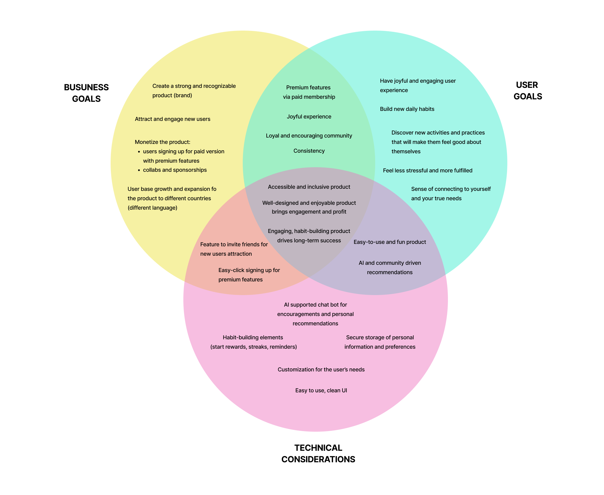
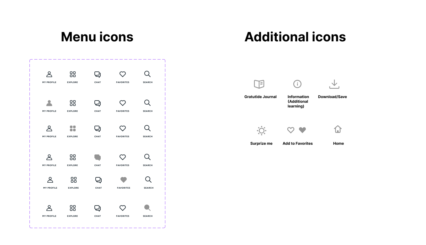
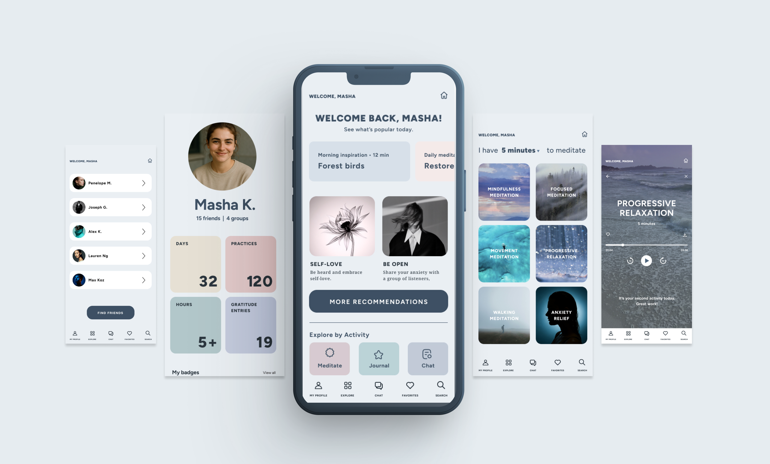
MIRA’s Main Features
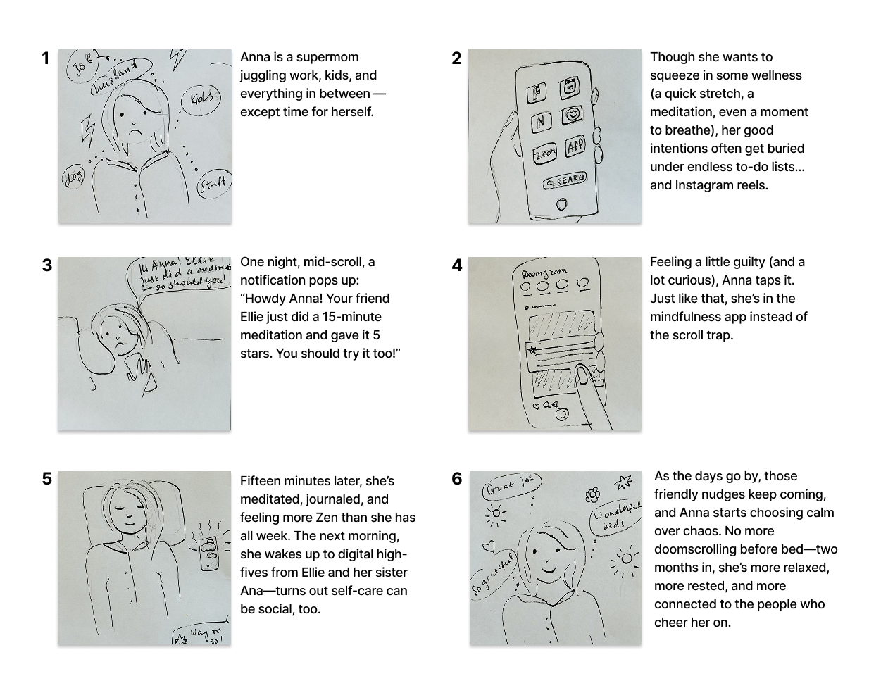
Storyboard
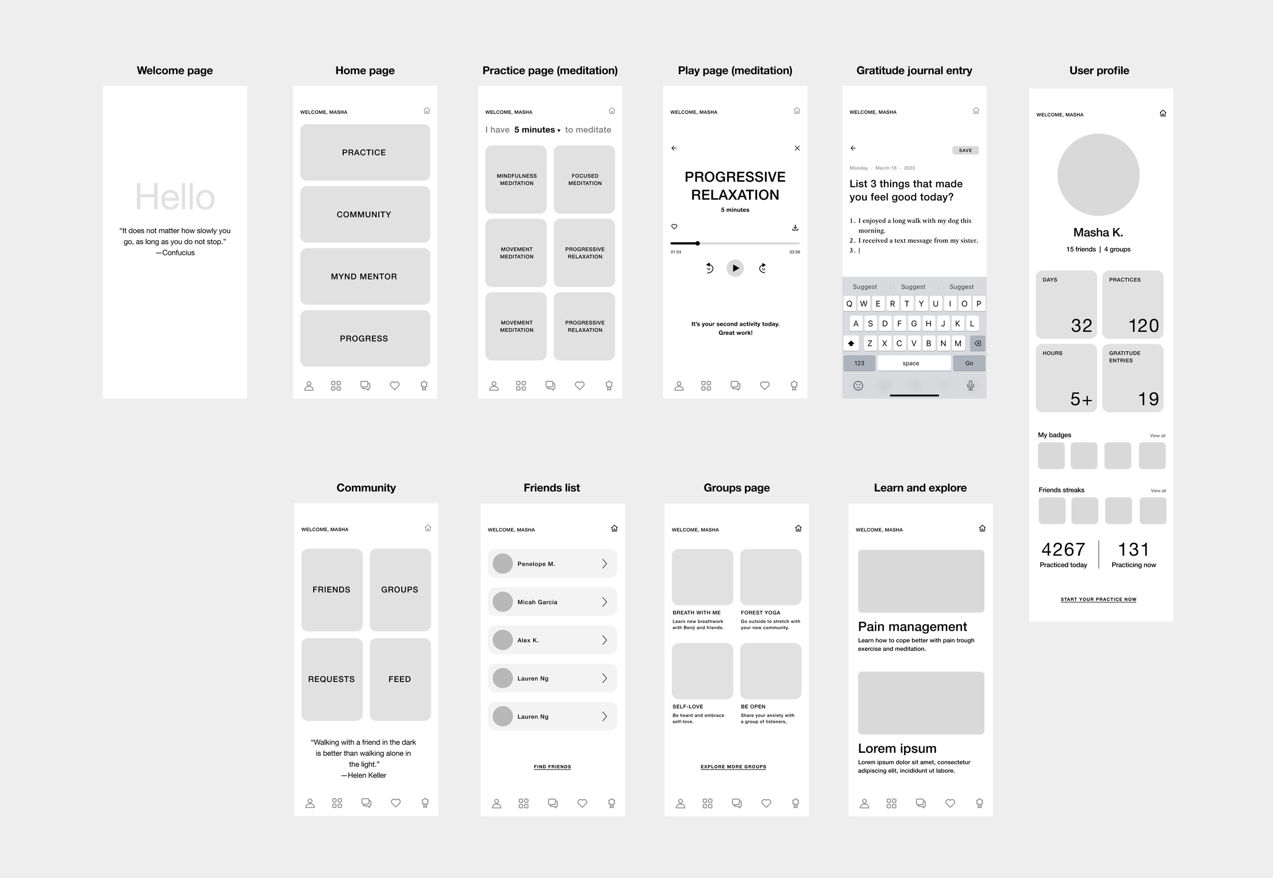
Wireframes
As I transitioned into wireframing, I found myself re-evaluating certain tasks, particularly when moving to mid-fidelity frames for both mobile and desktop. Reviewing my flows with users I had previously interviewed provided valuable insights, allowing me to clean up and further improve my designs. This collaborative feedback loop was essential in making my product more user-friendly.
Design
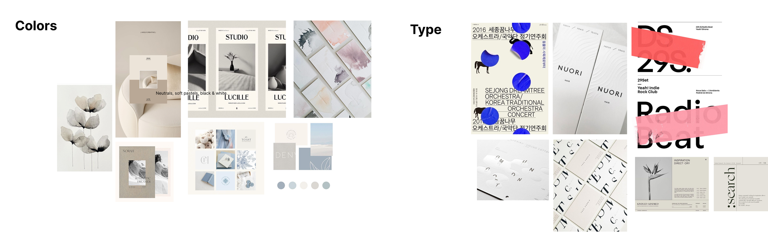
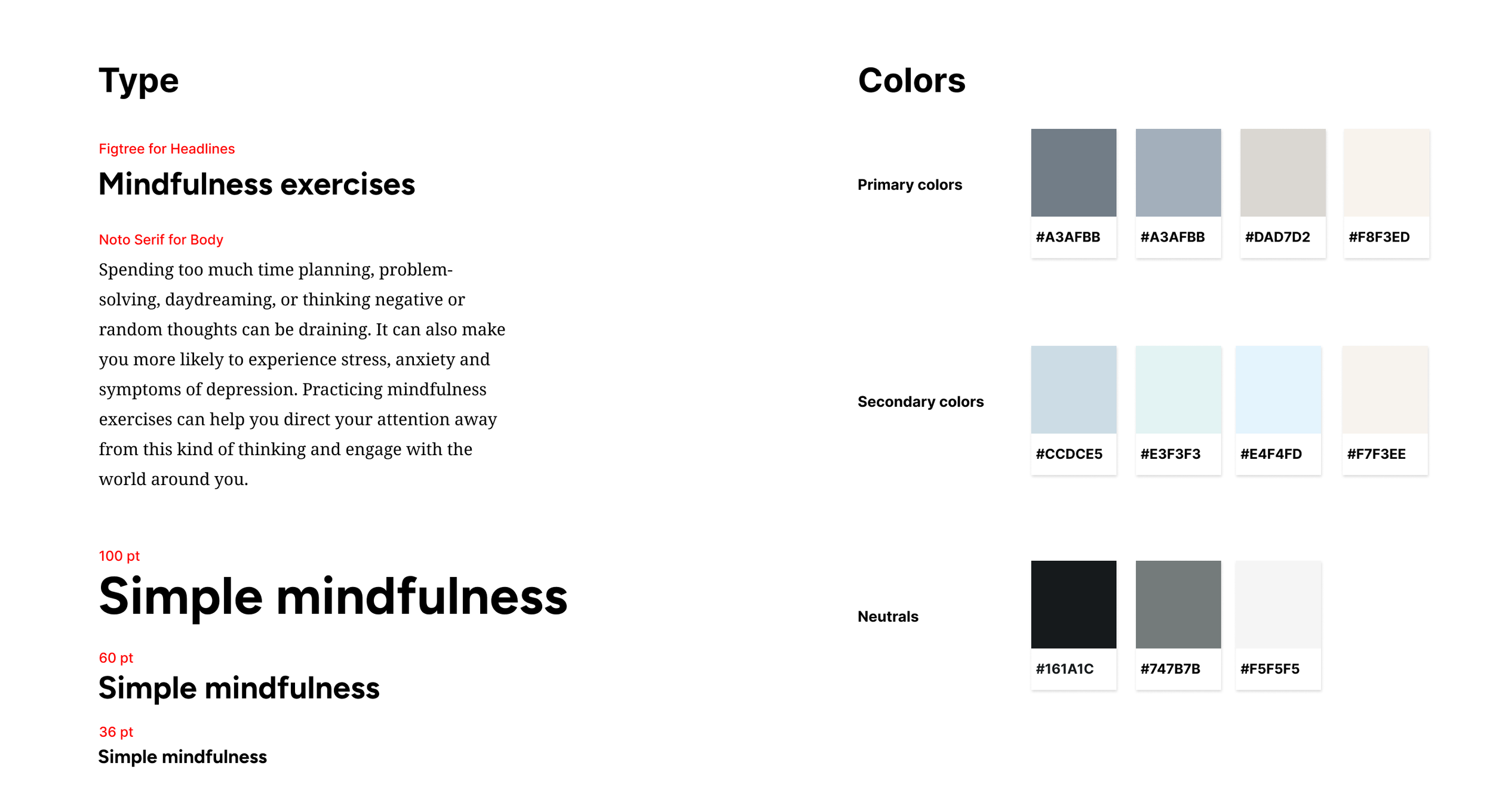
Guided by the core brand values, I developed a style guide that features a soft, calming color palette and a simple, clear typographic direction.
Visual Inspiration
Gentle shades of light blue, soft and pale colors create a soothing visual experience, helping to ease stress and anxiety. These colors mimic the quiet beauty of nature, inviting users into a space of calm reflection. By surrounding the user with these muted hues, the palette fosters a serene digital environment, encouraging relaxation, deep breathing, and a peaceful state of mind.
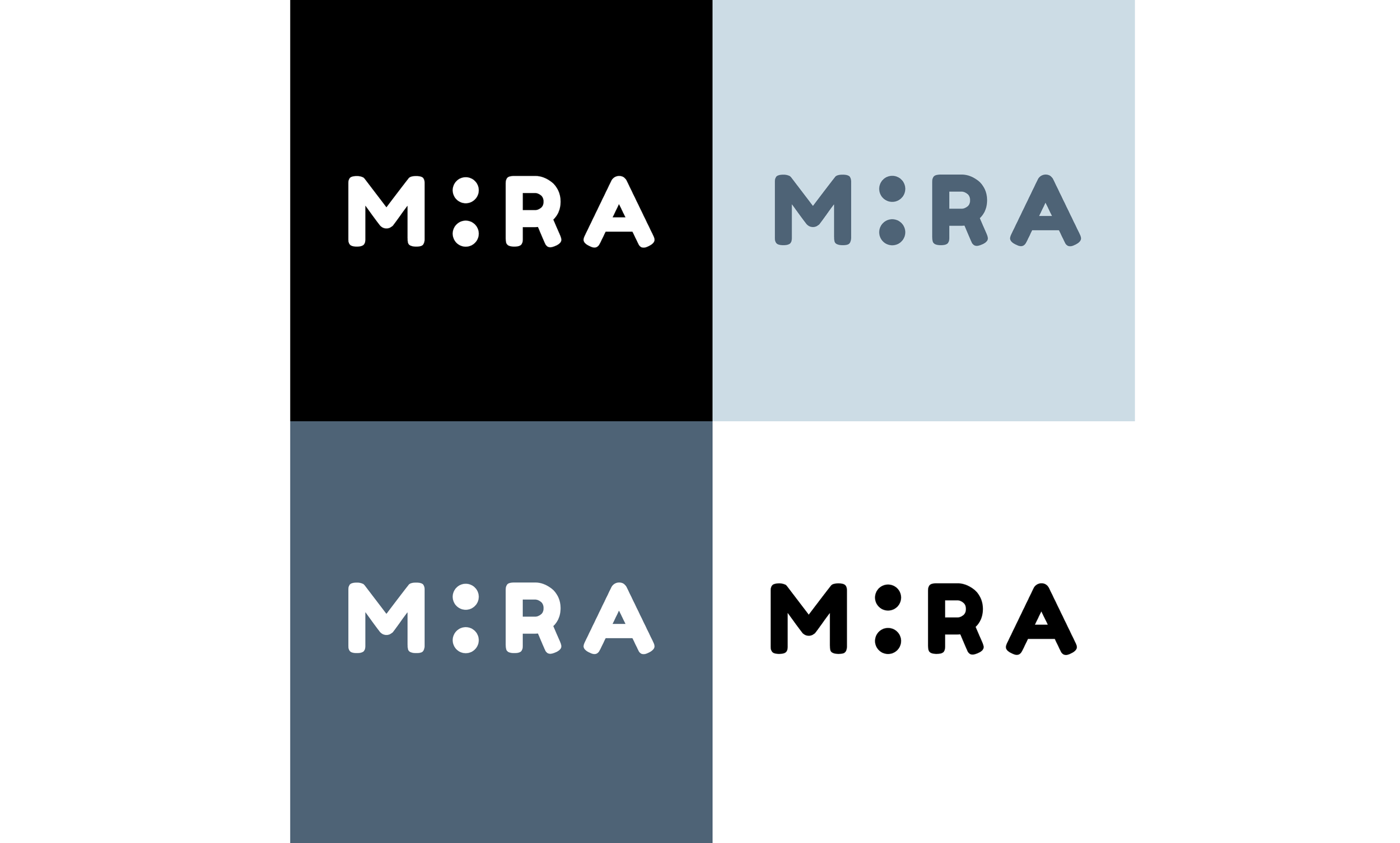
For the brand logo, I drew inspiration from clean, minimalistic logos and marks from the 1960s. Since my product is meant to evoke a calm state of mind, I focused on simple, clean shapes. After experimenting with symbols and browsing different fonts (I was aiming for something that felt soft and inviting), I found myself drawn to the letterforms of the Fredoka One typeface, designed by Milena Brandão from the Hafontia Foundry. I ended up replacing the letter “I” with two vertically stacked dots. I initially tried a single dot, but it didn’t read clearly. The two-dot configuration resembles the letter “I”, introduces a playful tone, and adds a visual break from the standard alphabet characters.
Usability testing
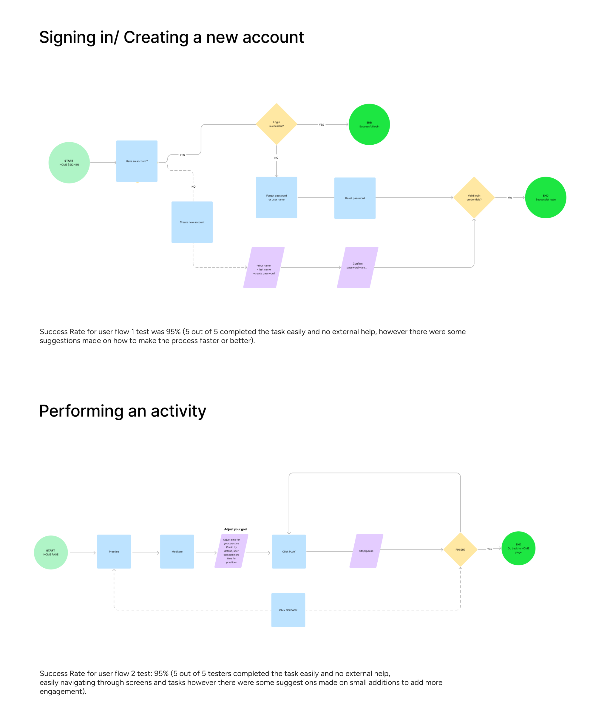
The usability testing study had 5 participants, 3 of those were already familiar with the project and 2 participants were completely new. 2 user flows have been tested:
1. Creating a new account/logging into existing account;
2. Performing an activity.
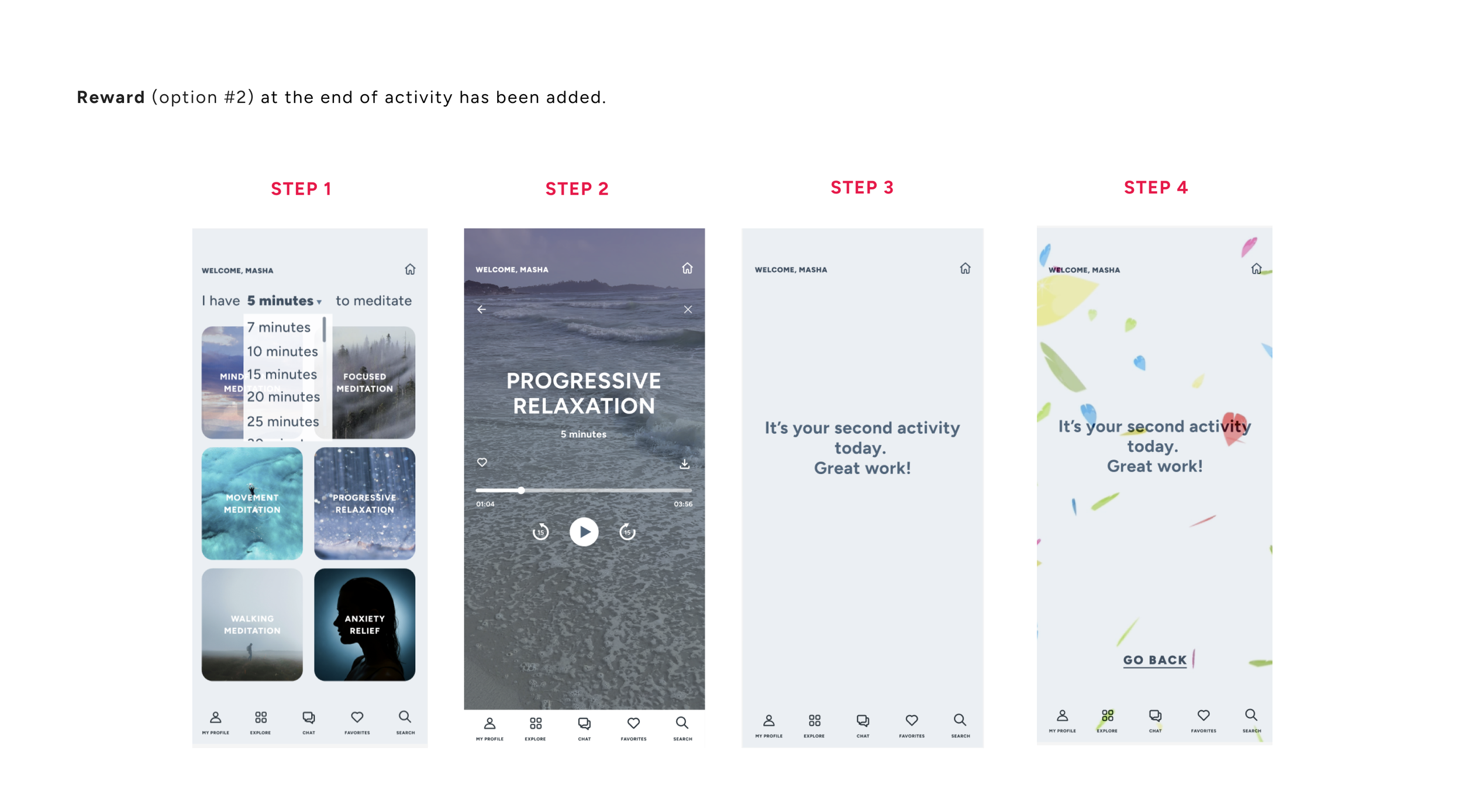
In addition to those user flows listed above I tested different types of CTA (learning about which one would have a higher engagement). Plus, a gamification feature of receiving a virtual accolade at the end of activity was tested as well.
Priority revisions
Based on the usability testing sessions for MIRA app, involving five participants several key usability insights emerged. Participants in general had not experienced high levels of difficulty navigating the interface, however there was some feedback around core workflows and labeling. While some users were able to complete tasks with minimal assistance, others encountered some minor roadblocks that disrupted the overall flow (and made them ask questions), suggesting additions in task predictability and user guidance. Following updates have been made as a result of conducted tests:
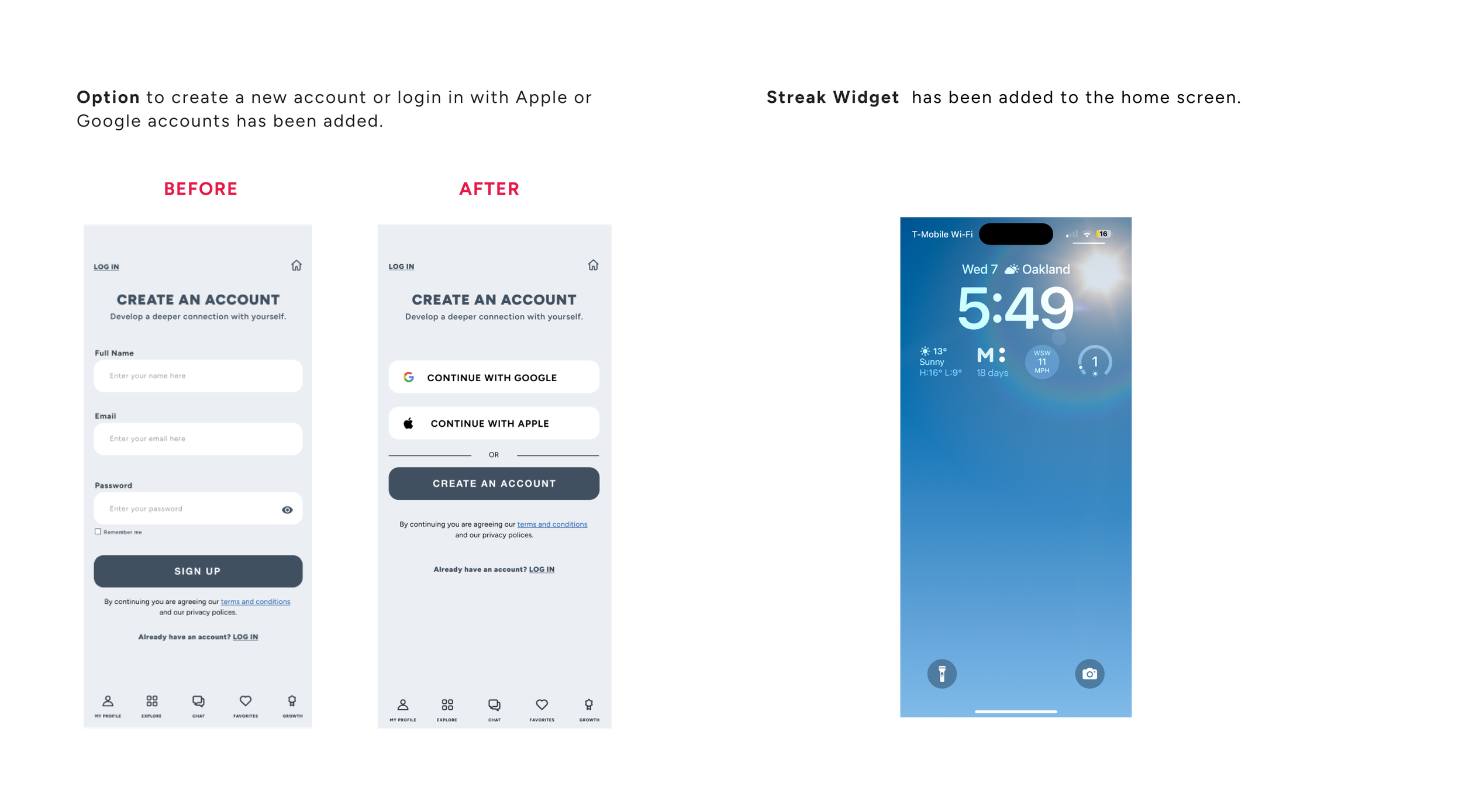
• An option to create a new account or login in with Google or Apple accounts has been added;
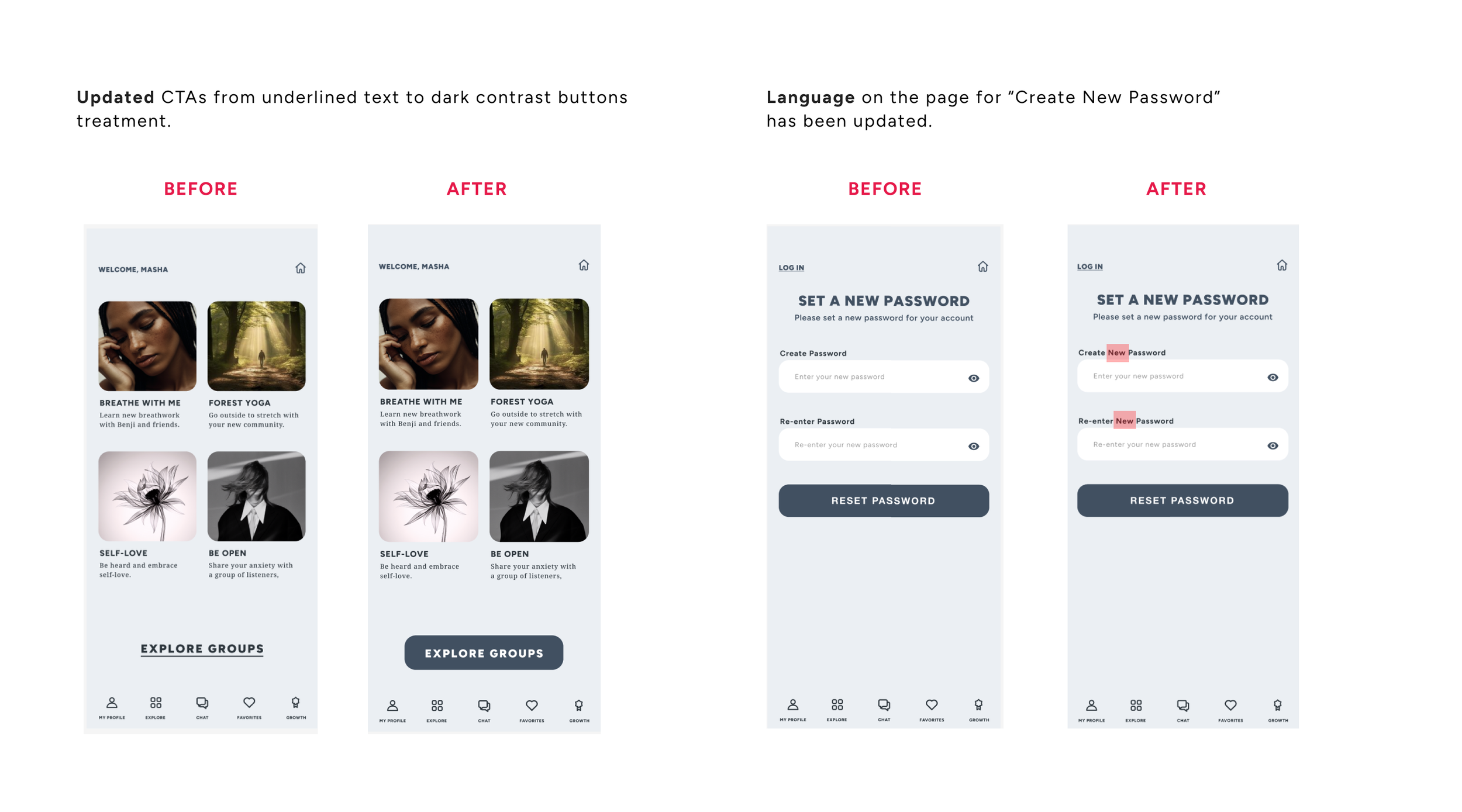
• Language slightly has been updated on the page “Create New Password” (so it’s more clear that user is creating NEW password on that particular page);
• CTAs has been updated to dark contrast buttons treatment;
• “Search” function has been added (bottom menu);
• “Reward” has been added at the end of activity (users selected option #2);
• Streak widget has been added at the lock screen.
Refined design
Guided by user feedback and fresh insights, I fine-tuned high-fidelity wireframes to better reflect real needs and behaviors. The result was a smoother, more intuitive experience that sparked excitement and earned enthusiastic feedback from users.
Thank you!