Problem
An iconic fashion brand needed a cohesive, scalable design system for promotional events that could work seamlessly across channels—email, site, retail app, and social—while maintaining a premium brand feel. Existing promotional assets felt fragmented, visually inconsistent with other marketing communications, and often overwhelmed customers with dense messaging.

Challenge
I was tasked with redesigning and building a flexible design system for all promotional events, ranging from one-day flash sales to large-scale retail moments such as Black Friday, Seasonal Sale and Friends & Family.
The creative team had long struggled to make promotional assets coexist harmoniously with broader marketing campaigns. Promotional emails and banners often felt visually disconnected, overly loud, and difficult to scale.
At the same time, the promo design team was reduced from four designers to one in a short period of time, while the volume and frequency of promotional campaigns increased. The system needed to be sleek, elevated, and extremely efficient—easy to update and maintain with limited resources.
Messaging presented an additional challenge: promotional copy was frequently long, complex, and confusing for customers, and it did not translate well visually across layouts and screen sizes.
Solution
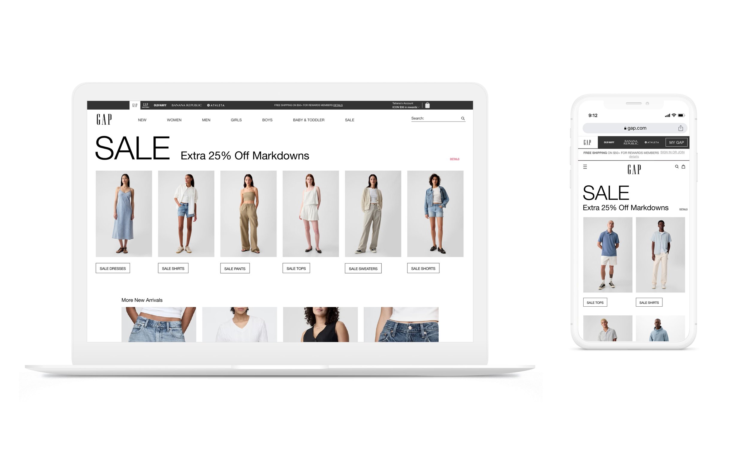
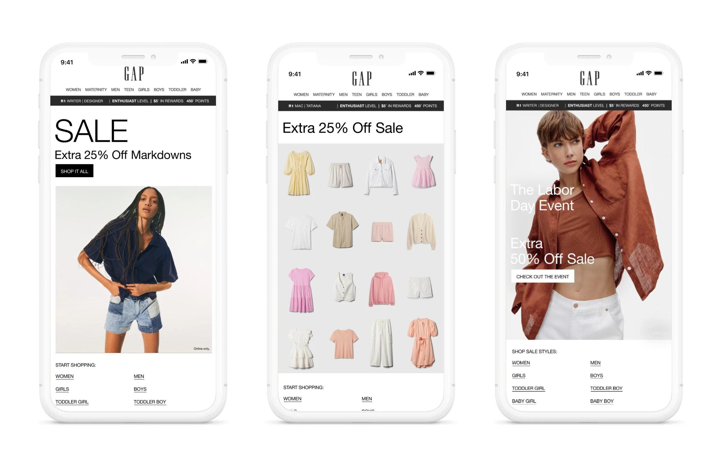
I designed a modular promotional design system that unified visual language, typography, color, and photography across all channels while enabling speed, flexibility, and scalability.

Key Outcomes
Unified visual language across channels
Established consistent typography, color usage, and photography styles across promotional emails, banners, landing pages, social assets, and site placements. This allowed promotional and marketing messages to be mixed and matched without breaking brand cohesion. Calmer typography and restrained color palettes replaced overly aggressive treatments, resulting in a more elevated, confident, and brand-aligned promotional presence.Scalable, easy-to-update templates
Created a set of clear, modular templates designed for efficiency. Email banners could be updated directly by copy team members, while site assets were structured to be updated by the production team using CSS—reducing dependency on design resources and improving turnaround time..Simplified and clarified messaging
Partnered closely with marketing and copywriters to develop a streamlined messaging framework. This resulted in shorter, clearer promotional messages that were easier to understand for customers and visually stronger across all formats.Operational efficiency at scale
The clean, systematic approach significantly reduced design overhead, enabling the promotional program to scale despite a reduced team. The system supported frequent launches while maintaining quality, consistency, and brand integrity.
Impact
The new promotional design system improved visual cohesion across channels, elevated the brand’s promotional presence, reduced production friction, and enabled a lean team to support an increasingly complex promotional calendar.
By refining the design system, simplifying layouts, conducting multiple A/B testings, and rethinking CTA placement in close partnership with marketing, updated promo design system helped drive strong performance across site, email, and app — homepage engagement grew 150%+ YOY during GapCash and over 300% during Seasonal Sale, while email CTR increased despite reduced send volume.