The Problem
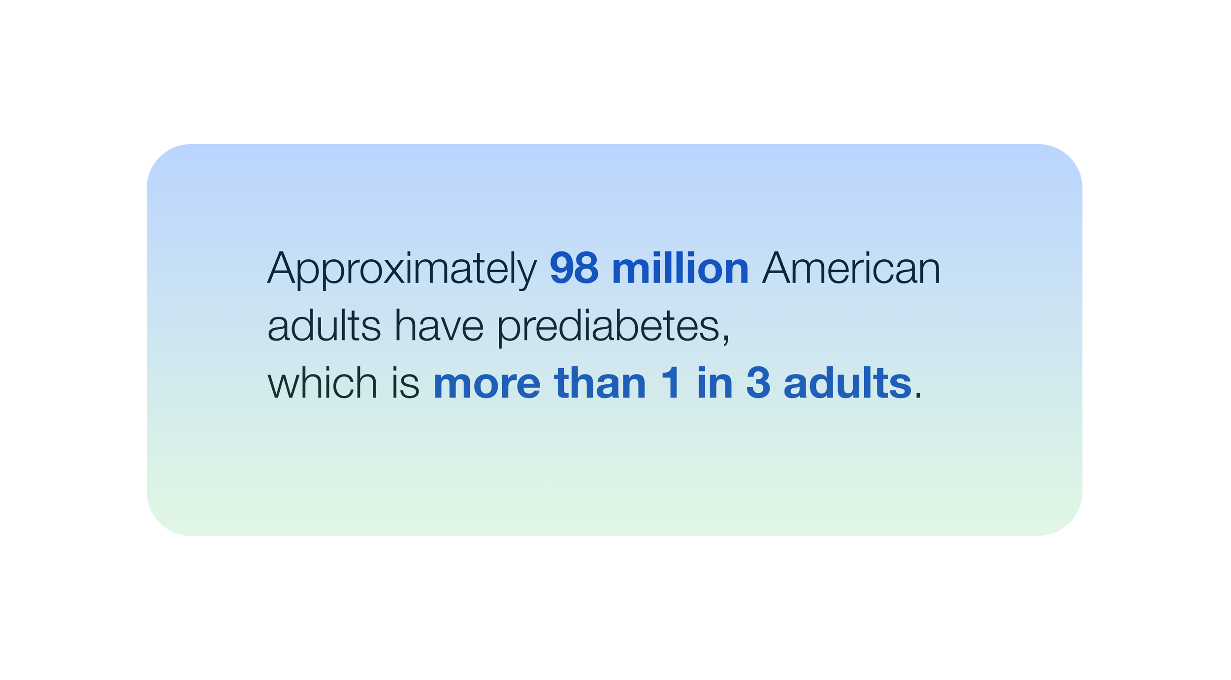
Millions of people with prediabetes struggle to make sustainable lifestyle changes that can help them reverse the condition. Despite awareness and resources available online, many users feel overwhelmed by fragmented information and lack of personalized, motivating guidance.
The Audience
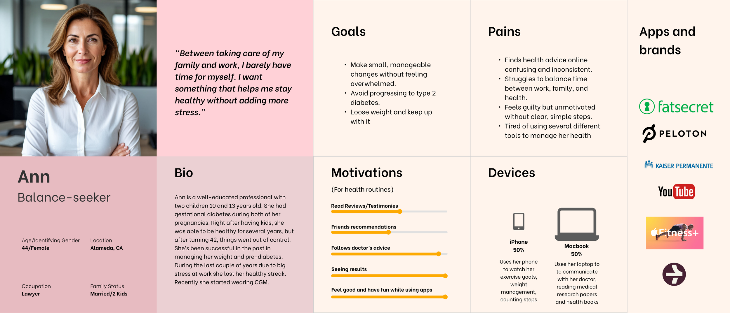
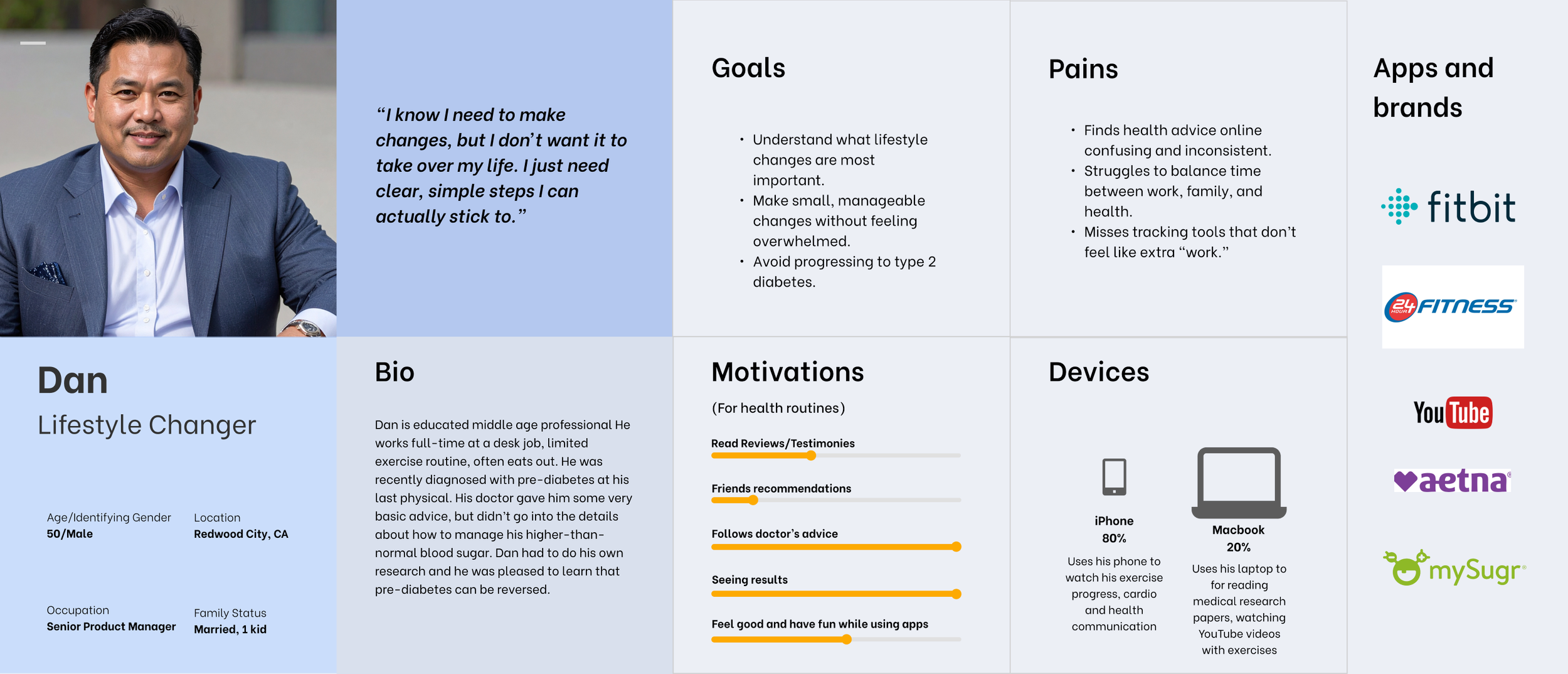
Reversi is designed for adults who have been diagnosed with prediabetes and want to take an active role in improving their health through small, consistent daily habits. Many of them already track activity or nutrition using apps like Apple Health, Fitbit, or MyFitnessPal, but find those tools too data-driven and not actionable enough.
How Reversi Can Help?
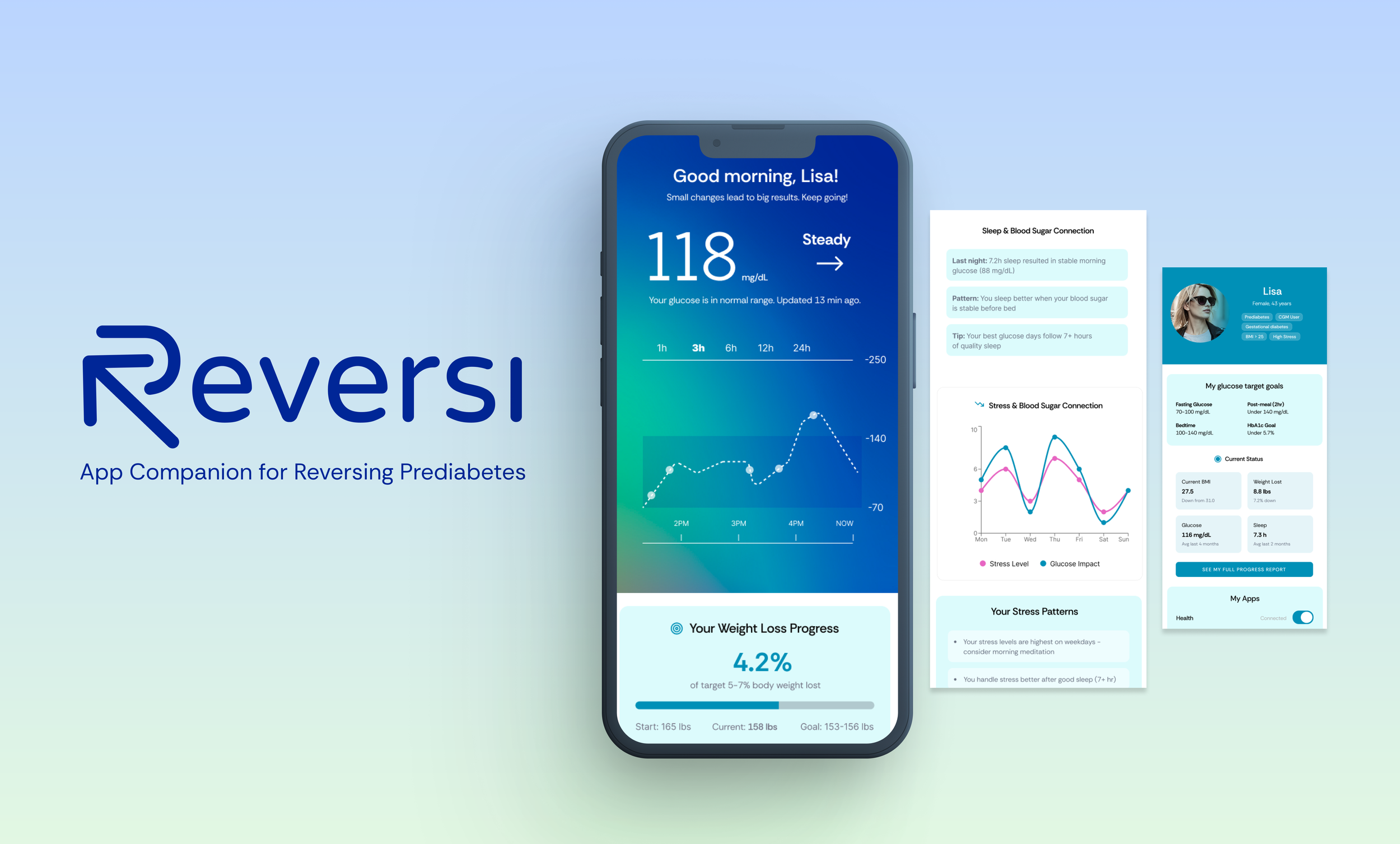
By offering an easy, habit-based approach, Reversi empowers users to understand their patterns, take small achievable steps, and celebrate progress along the way. Reversi encourages users to make healthy habits stick by combining:
Personal data tracking (activity, nutrition, sleep)
Teaching the user how certain activities and habits affect the glucose levels
Helping to build healthy habits using small steps day-by-day
Providing daily tips and insights that promote awareness
and learning
Positive reinforcement that motivates users without guilt
Project
Project duration: 6 weeks (concept to prototype)
My role: End-to-end UX/UI designer — responsible for research, ideation, user flows, wireframes, testing, and final high-fidelity design.
Deliverables: Research insights, personas, user flows, low- and high-fidelity prototypes, and 2 usability testing reports.
Process: I used an iterative design approach, continuously testing
and refining based on user feedback.
User Research
Research Goal: To understand the behaviors, motivations, challenges, and support needs of people living with prediabetes in order to design an easy-to-use mobile app that helps them make gradual lifestyle changes and successfully reverse their condition.
Research Objectives: Identify daily challenges people with prediabetes face in maintaining healthy habits (diet, exercise, sleep, stress).
Explore motivation factors that encourage individuals to take action toward reversing prediabetes.
Understand barriers that prevent people from adopting or sustaining lifestyle changes.
Assess digital behaviors: how people currently use apps, tools, or resources to support their health.
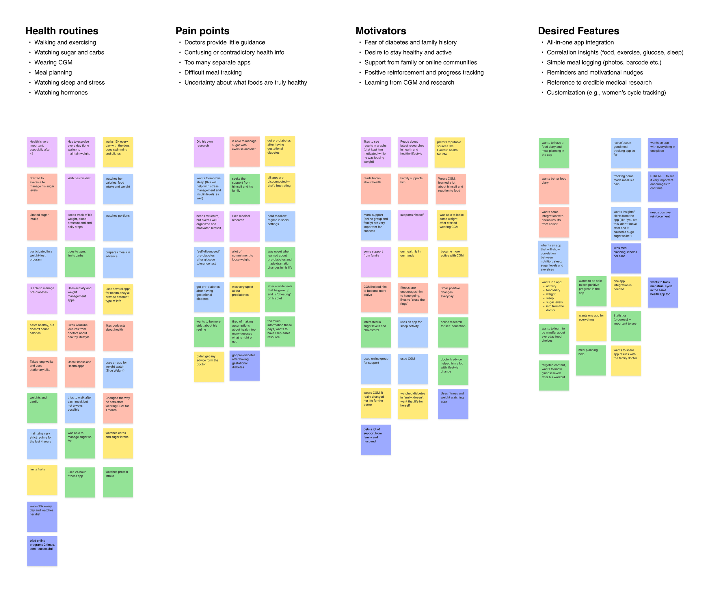
Key Insights
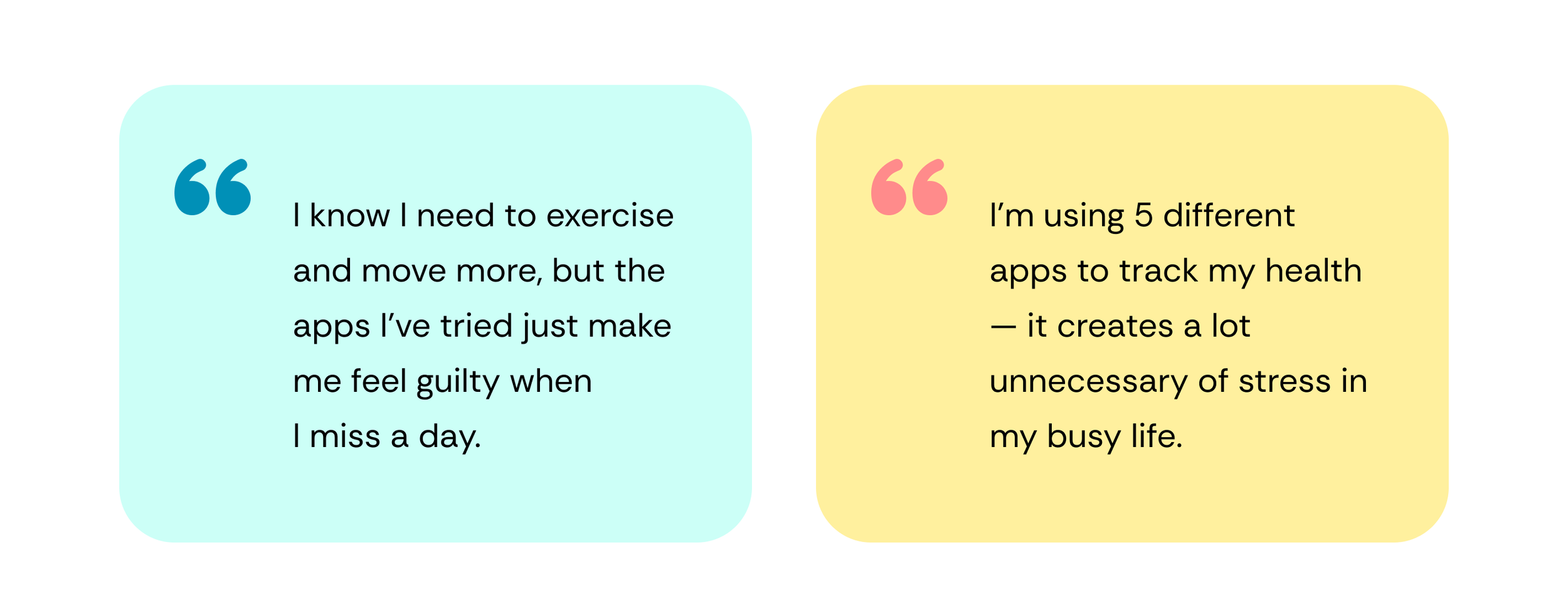
Participants (ages 42–70) with prediabetes or borderline glucose issues described a mix of emotions, lifestyle adjustments, and digital tool use. Most took proactive steps to manage their health (through diet, exercise, and tracking), but faced challenges with consistency, fragmented digital tools, and unclear medical guidance. Many expressed frustration with having to self-educate, seek credible resources, and experiment to understand what truly works for their body.
- Users often start tracking but lose motivation because progress isn’t visible or meaningful.
- Many prefer simple, visual cues over numerical data.
- Users value learning tips and positive reinforcement that explain “why” habits matter.
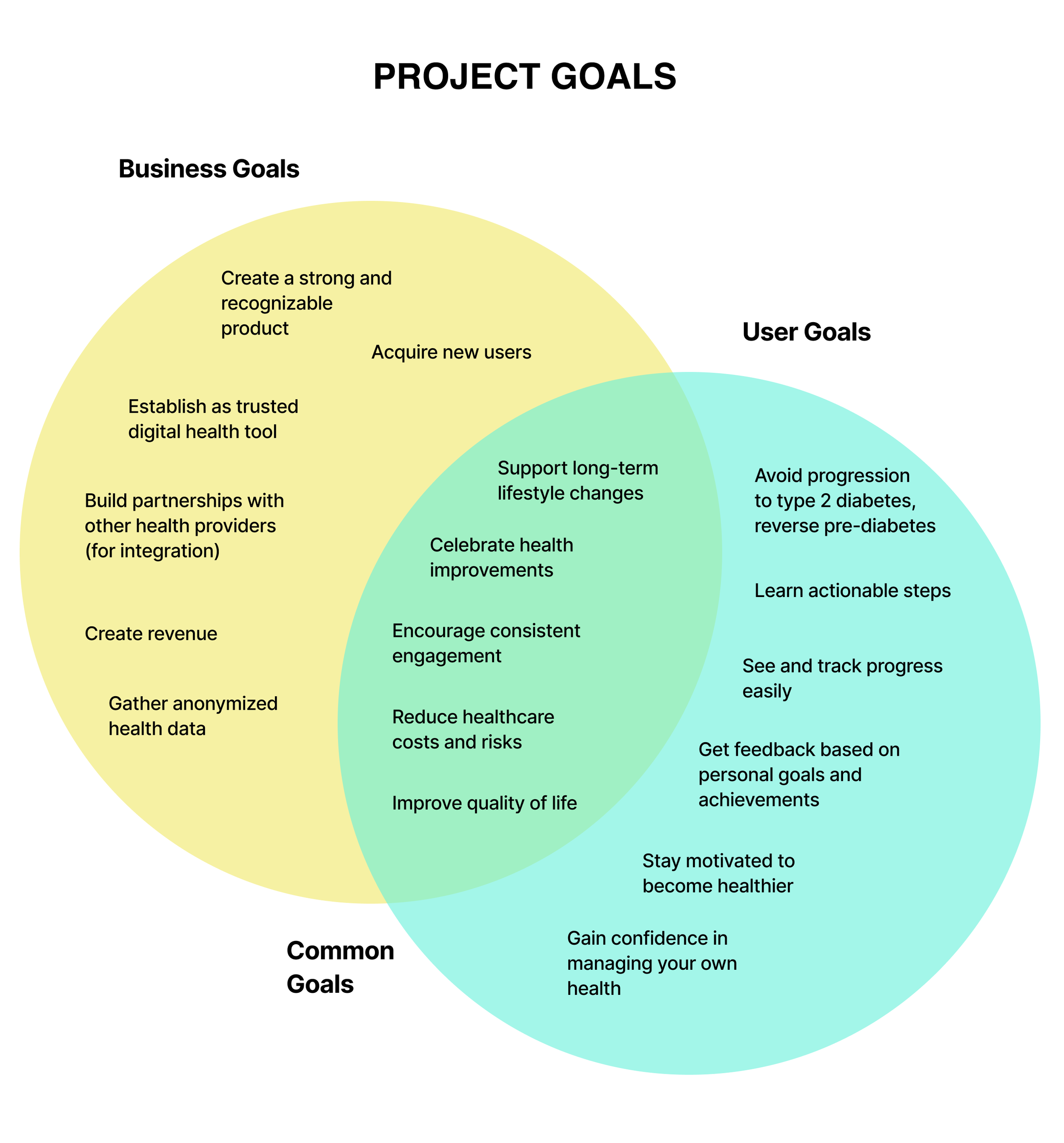
Problem Statement
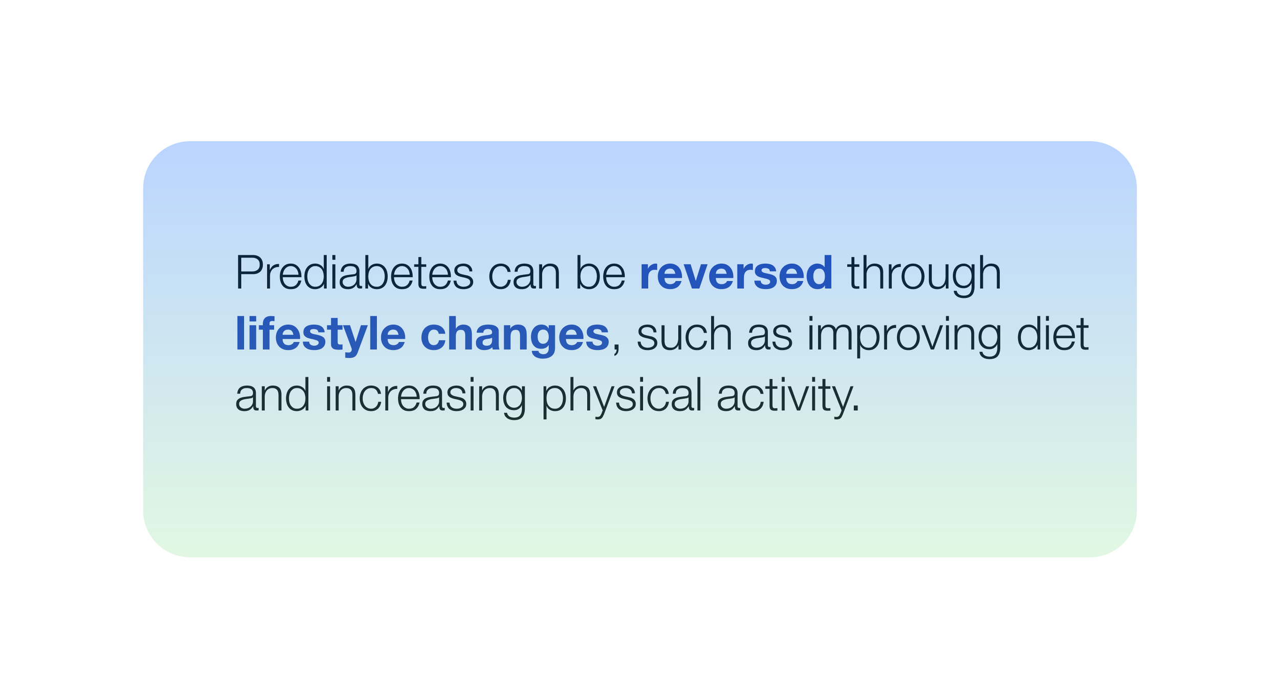
People with prediabetes need a simple, encouraging way to track their habits and learn how small actions can improve their health, so they can stay consistent and feel in control.
Design Approach
I focused on creating clear, guided user flows with minimal distraction. The design emphasizes encouragement and progress, not guilt — using friendly and energetic colors, approachable language, and clear progress infographics.
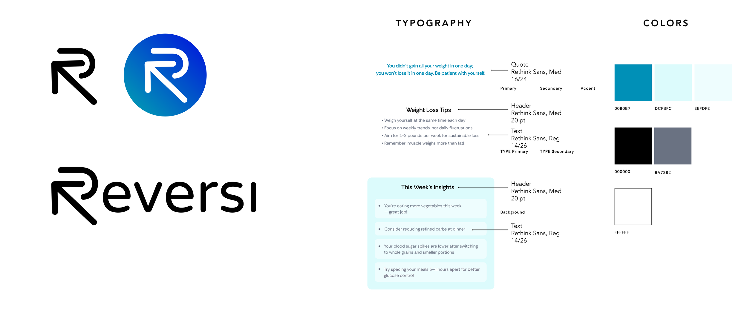
Branding
Tone: Supportive, optimistic, human
Colors: Warm greens and blues (health and calmness)
Logo: Inspired by the idea of “reversal” and continuous growth
Core Brand Values
Empowerment
Empowerment through knowledge. Reversi app provides clear, evidence-based guidance so users feel in control of their health journey.
Small Steps for Big Changes
The app will help to make small, consistent steps that build lasting lifestyle changes — no quick fixes, just real results.
Support
Reversi app meets users where they are, with empathy and encouragement, creating a safe and motivating space.
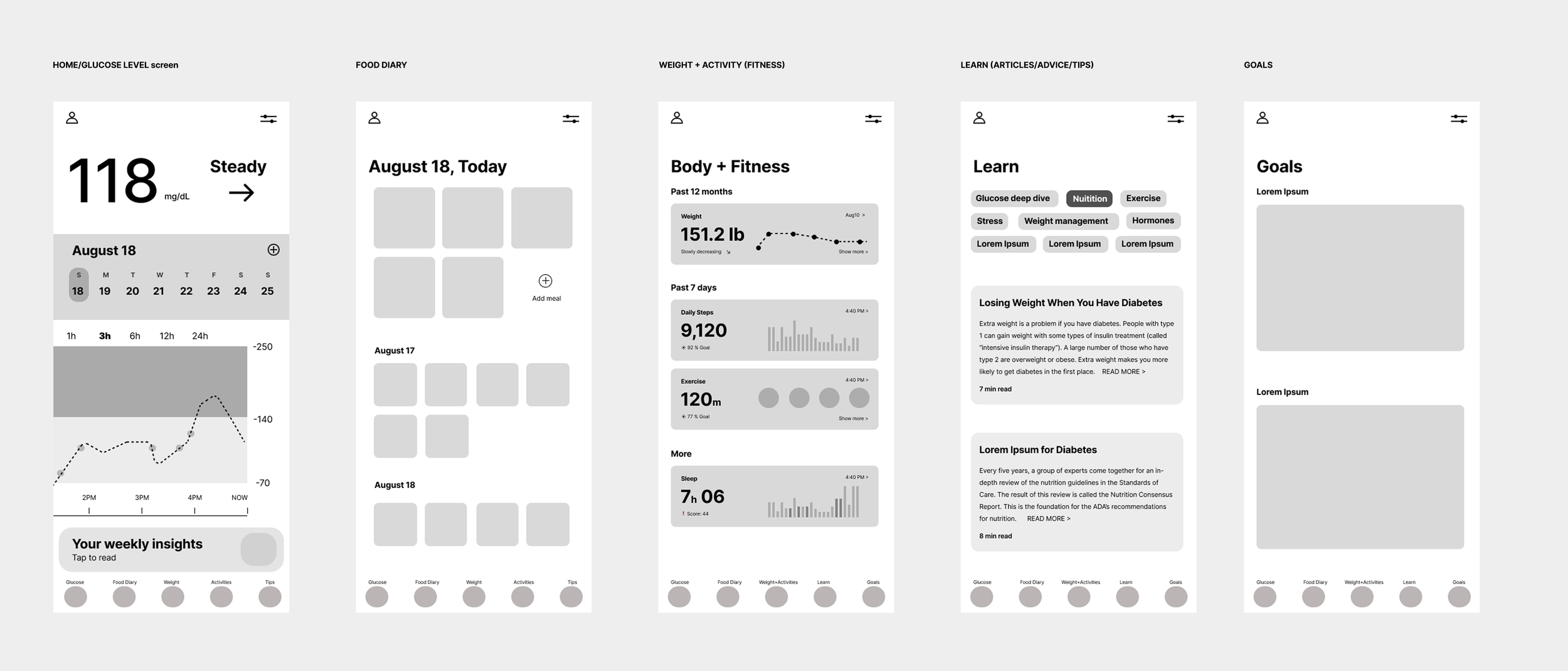
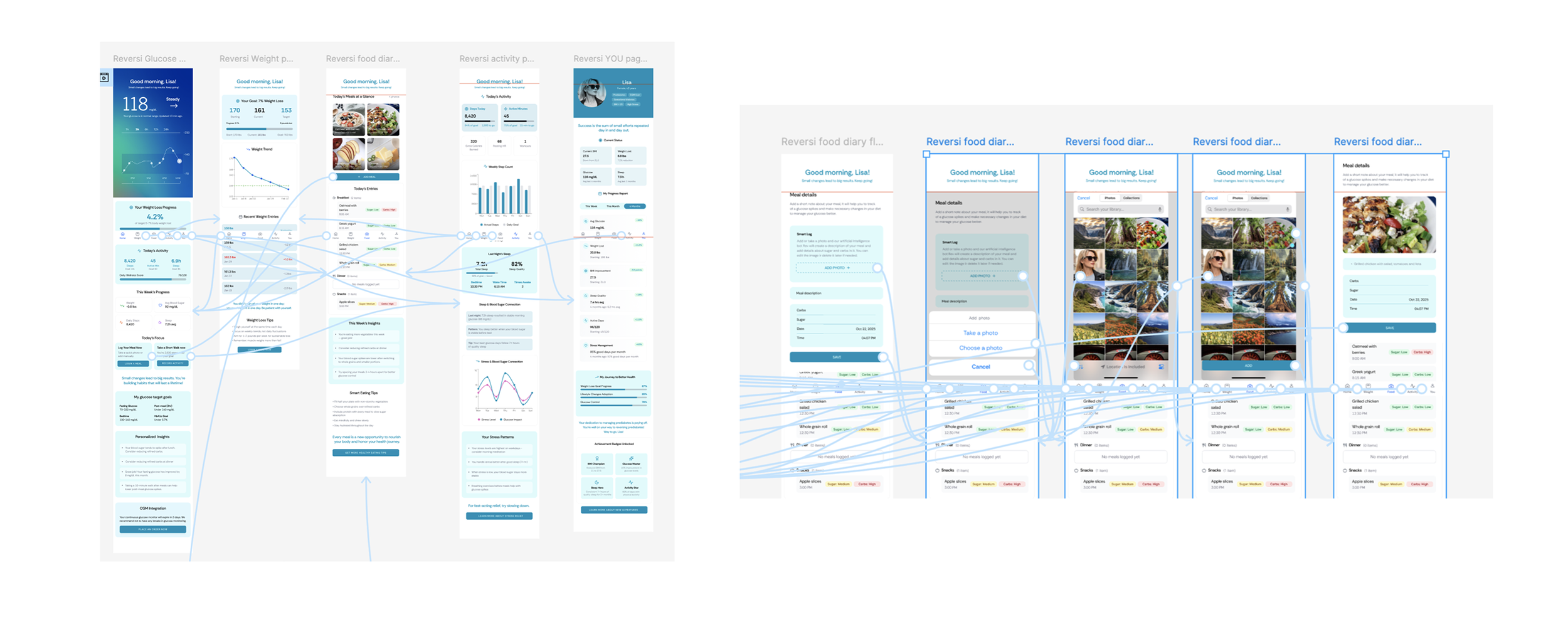
Wireframes
I started with simple BW lo-fi layouts, then built low-fidelity wireframes in Figma to test the core flows. And additionally tried to build simple flows via Figma Make. I’ve tested both BW frames and generic layouts for simple flows with my users. After feedback, I iterated and developed high-fidelity screens with consistent design system components.
Testing method
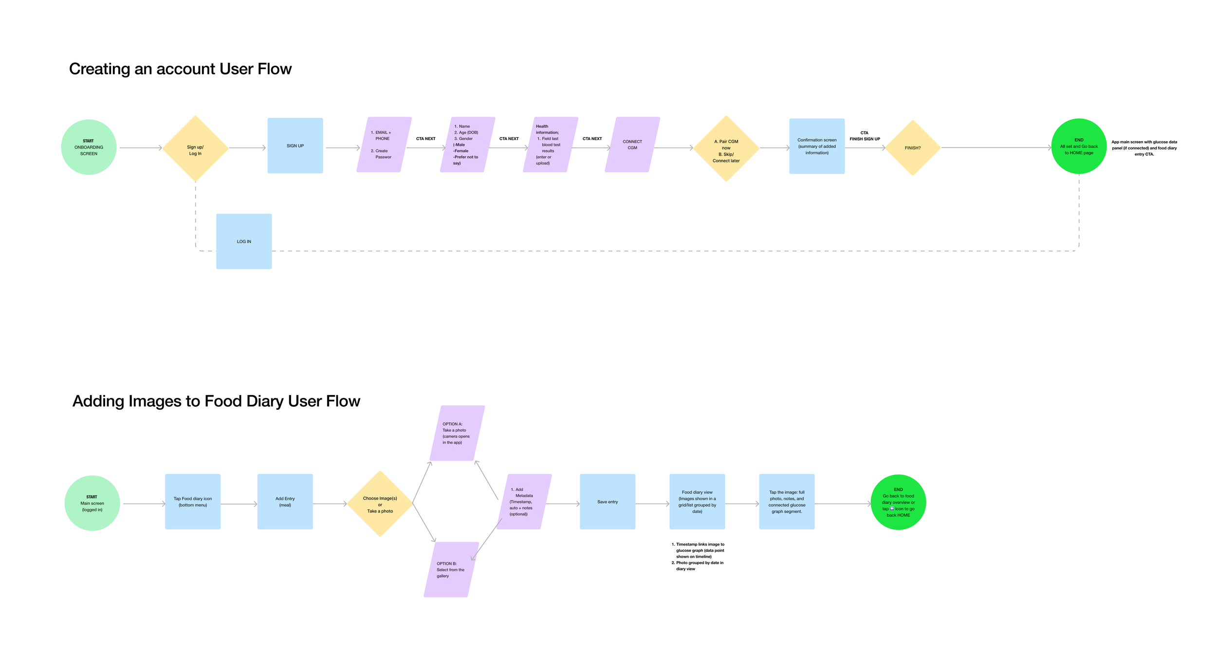
I conducted remote usability tests with 5 participants from the original research group, focusing on two core flows:
Setting up an account and connecting integrations
2. Adding a meal photo to the food diary
On top of that I gathered feedback about overall look and feed, clarity of displayed information and hierarchy.
Feedback
Feedback highlights:
1. Users appreciated the clear onboarding and “learn-as-you-go” approach.
2. The manual input option was praised by those not using wearables.
3. Two participants suggested an edit/delete option for food entries, which was added in the next iteration.
4. The “Tips” feature was described as “motivating and informative” and seen as a reason to return daily.
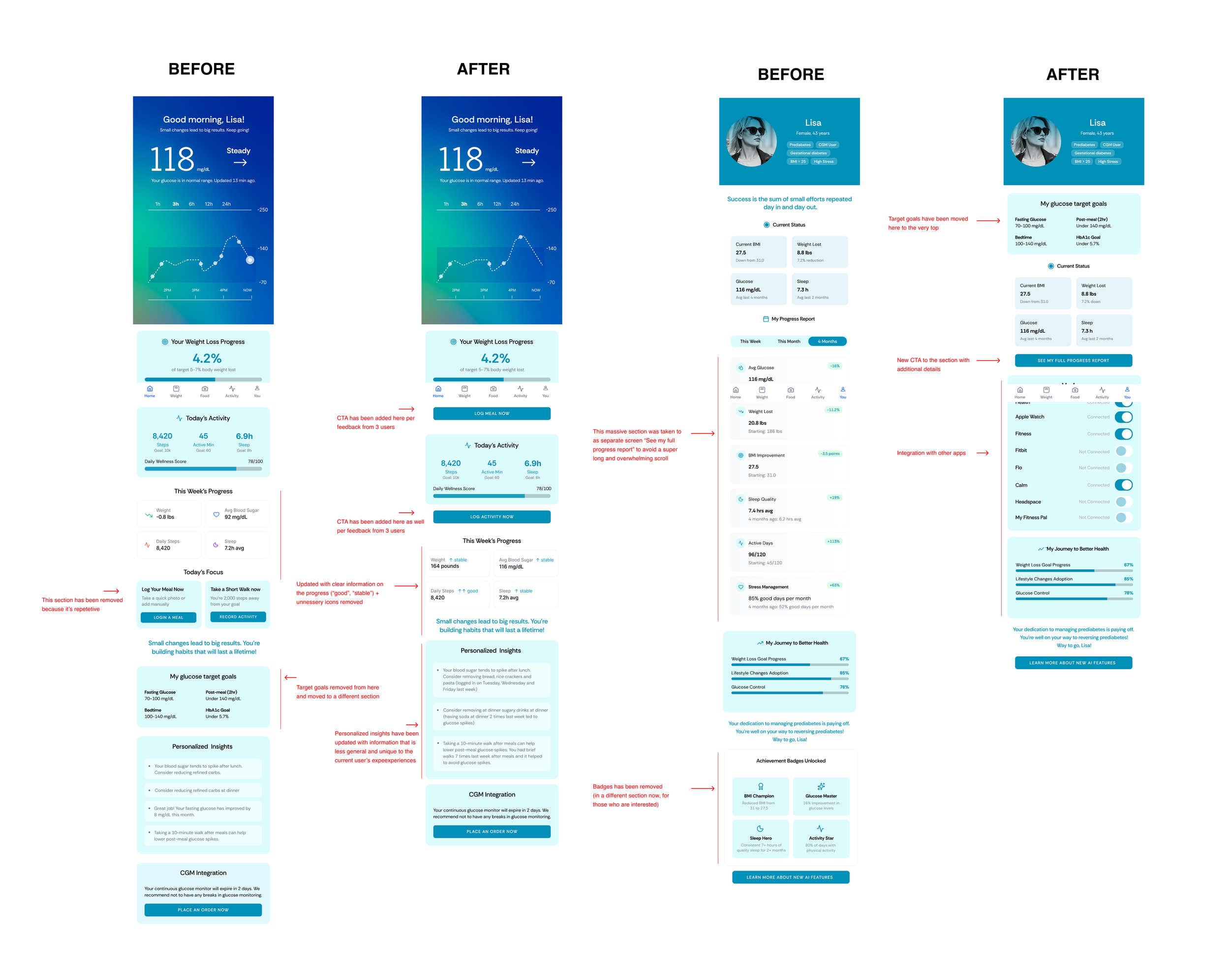
Design Changes
Simplify navigation: Introduce a clear, consistent primary CTA (e.g., “+ Add Data”) and contextual buttons between sections.
Support manual data entry: Let users log workouts, stress, or glucose manually.
Personalize insights: Offer more specific, food-level insights.
Allow hiding or editing insight cards.
Enhance data visualization: Show short- and long-term glucose trends, averages, and event overlays.
Introduce color indicators for high/low glucose.
Refine layout and hierarchy: Shorten long scrolls (Profile page), and make data-action connections clearer.
Keep the motivational tone: Continue using quotes and educational tips, users find them uplifting and unique.