
Responsive Website Design for Atelier Green
Designing a family-friendly, trustworthy, and elegant digital presence for a sustainable architecture consulting business.
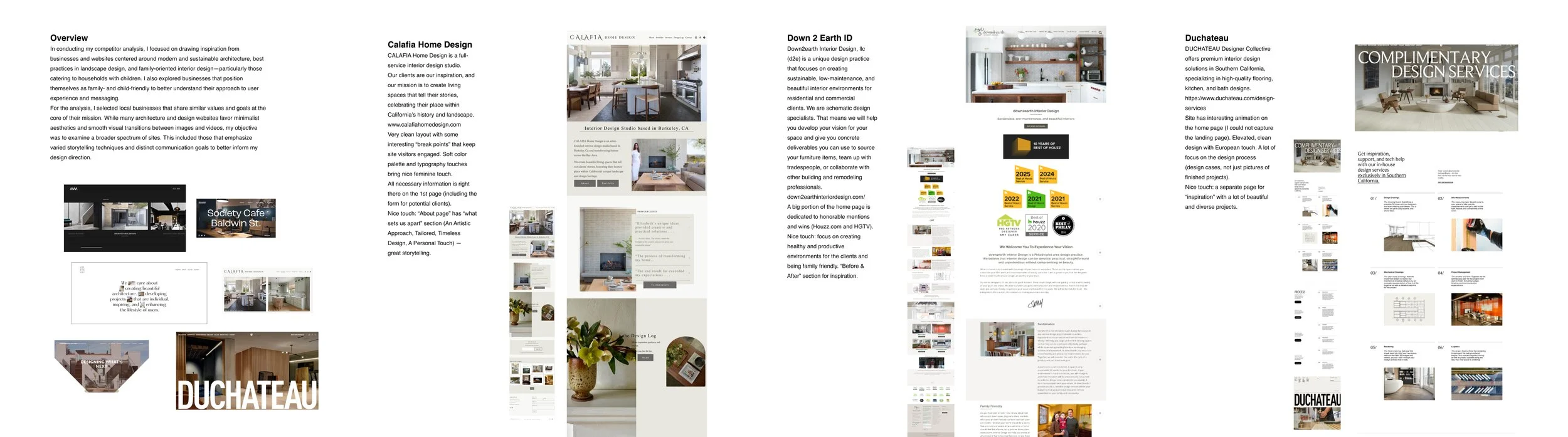
Overview
Atelier Green is a new consulting business focused on helping young families make healthier and more sustainable choices in home building and interior design. From non-toxic materials to environmentally conscious design practices, the goal is to empower parents to create safe, future-forward spaces for their children.
This project involved designing a responsive website that clearly communicates the business’s mission, builds trust with families, and encourages visitors to book a free consultation.
My Role & Timeline
Role: UX/UI Designer (solo) — research, IA, UX flows, visual design, prototyping
Duration: 4 weeks
Deliverables: Full desktop & mobile designs, brand tile, moodboard, updated flows, prototype animations
This was my first time designing for a small business, which made client collaboration a central part of the process.
1. Problem
Families want healthier homes—but lack the guidance to make safe, sustainable choices.
Research interviews showed that parents care deeply about the materials used in their homes—especially regarding safety, indoor air quality, and non-toxic finishes. However, many feel overwhelmed by the amount of conflicting information available online and struggle to find trustworthy, accessible resources.
Key Pain Points
Difficulty finding clear, trustworthy information on non-toxic and eco-friendly materials
Overwhelming amount of online content
Budget concerns related to sustainable choices
Uncertainty about whether contractors or designers understand their priorities
Business Challenges
Communicate expertise and mission clearly
Build trust with potential clients
Create an intuitive funnel toward consultation sign-ups

2. Research
Participants: 5 respondents — all parents, homeowners, or planning construction
Key Findings
Priorities
100% ranked quality of materials as their top priority
80% emphasized budget
Sustainability was not always an explicit priority, but appeared frequently in emotional context (health, children’s safety).
Sustainability & Safety
All participants wanted non-toxic materials
Strong interest in safe paints, natural flooring, chemical-free spaces
Knowledge & Information Gaps
4 out of 5 said it’s difficult to find trustworthy information
Most turn to the web, professionals, or family
Cost Concerns
Mixed willingness to pay more for sustainable options
Some would invest for health reasons; others were skeptical of paying “for moral points"
What a “Healthy Home” Means
Non-toxic paints
Good air quality (no toxic dust)
Natural, durable materials
No harmful chemicals
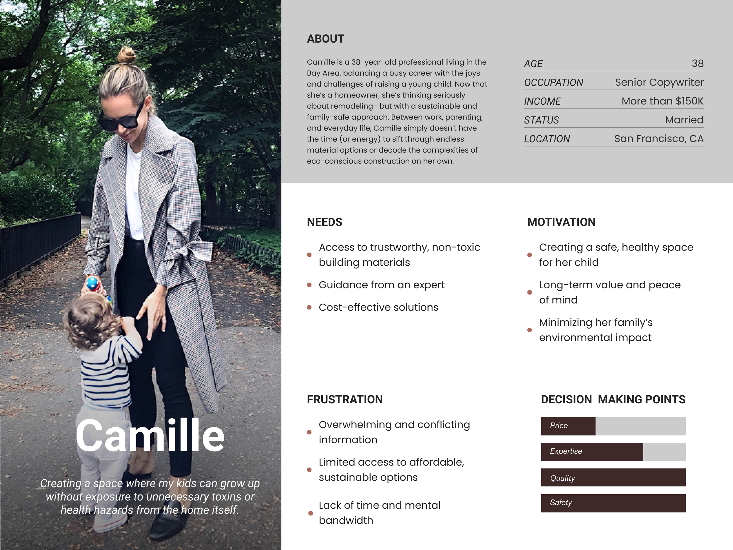
3. Target User Persona: Camille
A 38-year-old San Francisco parent balancing a demanding career with raising a young child. She wants a safe, sustainable home but doesn’t have the time or knowledge to research materials or evaluate eco-friendly options.
Needs
Trustworthy guidance
Time-saving recommendations
Healthy, natural materials
A simple, reassuring experience
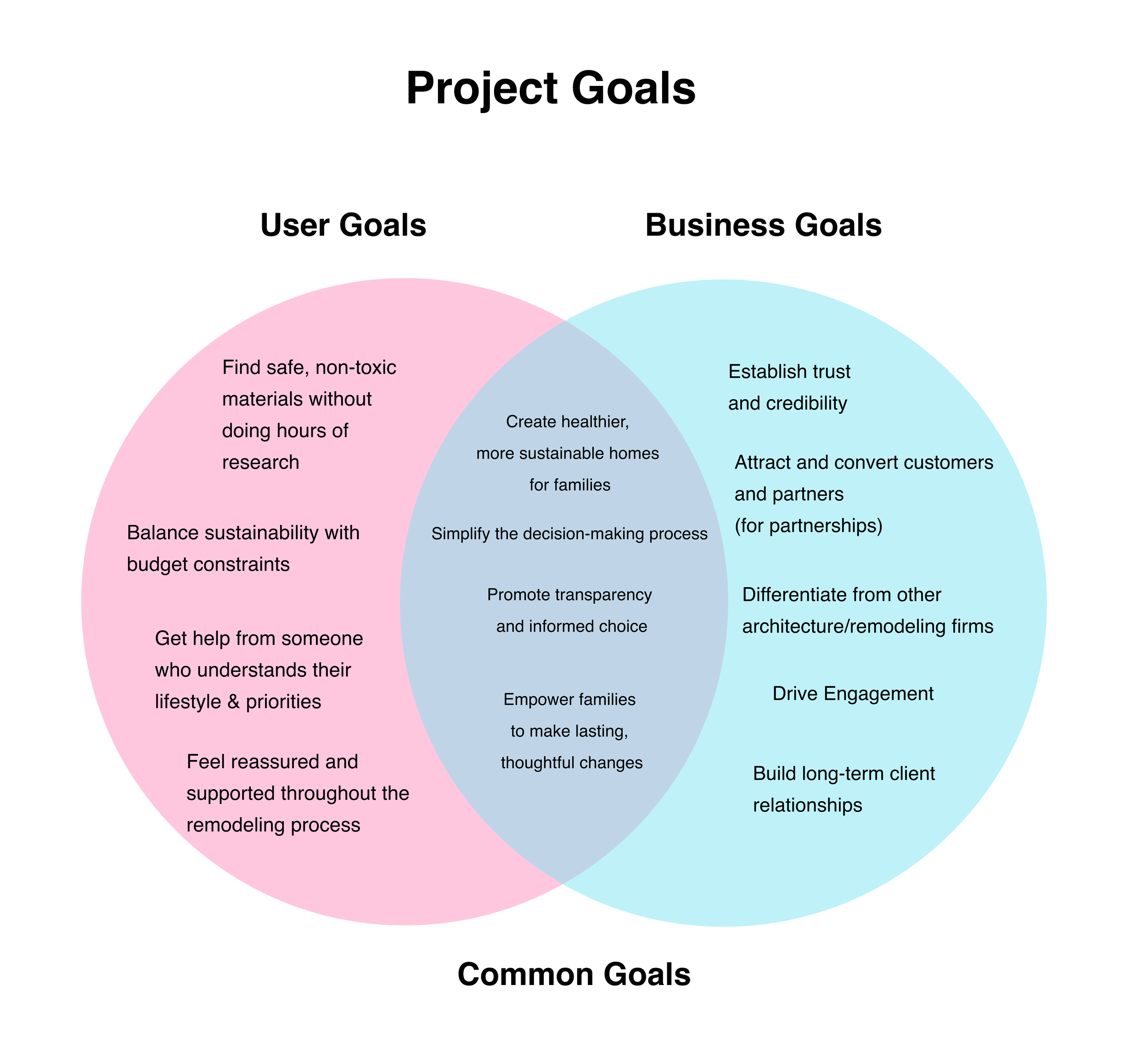
5. Design Strategy
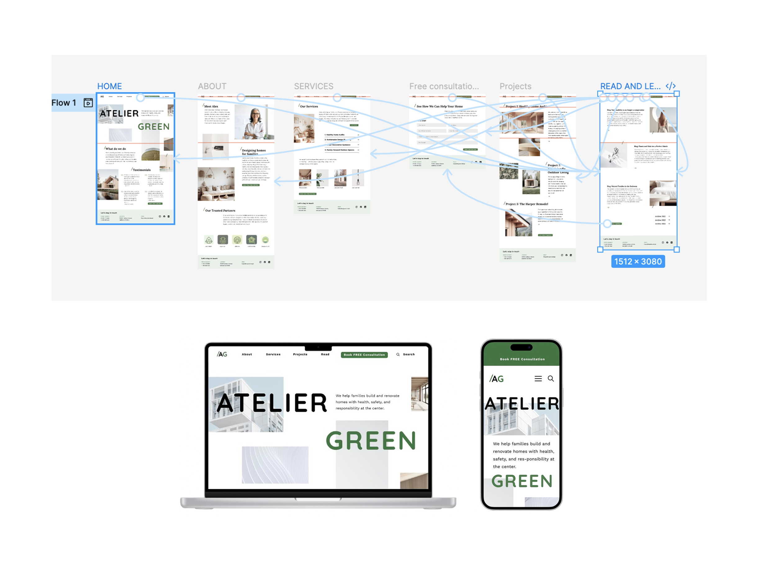
Website Architecture
Website Architecture
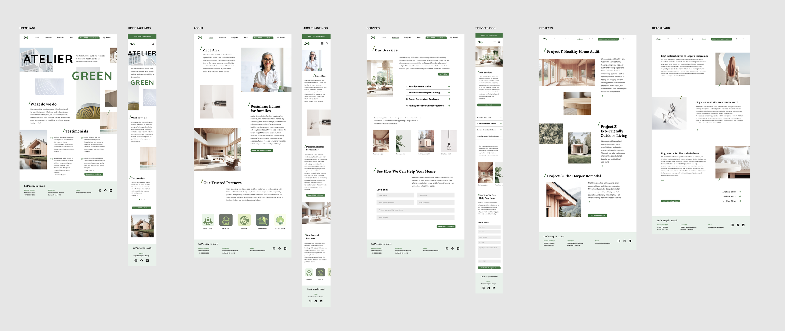
Six core pages: Home, About, Services, Projects, Read + Learn, Partners
Each includes a prominent CTA (“Book a Consultation,” “Start Your Project”).
Design Approach
Warm, minimal aesthetic
Neutral palette with soft green accents
Family-friendly without being juvenile
Clear, digestible layout
Mobile-first for on-the-go parents
AG project all pages
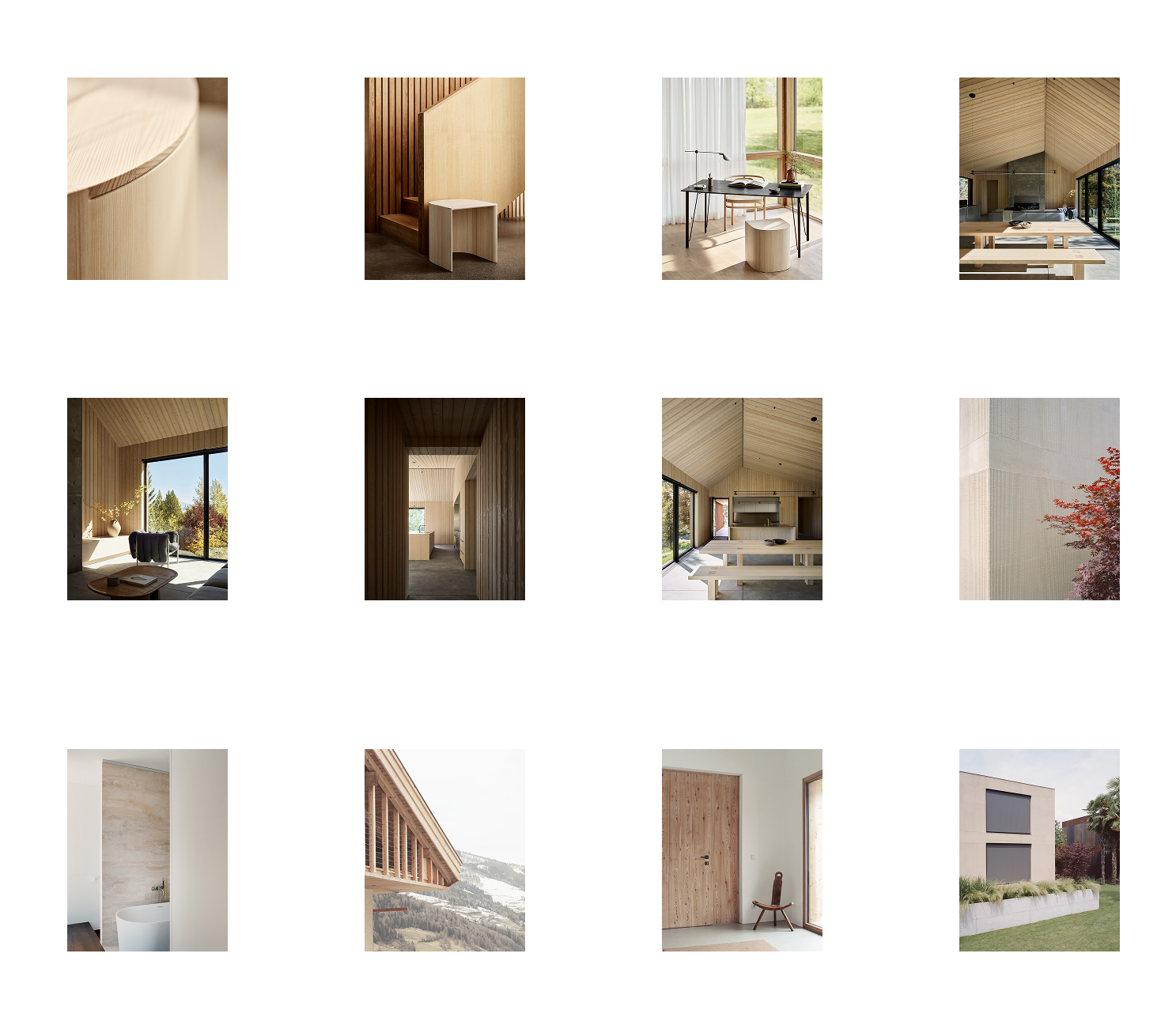
Mood board & Photo art direction
For the mood board and photo art direction, I selected imagery with natural lighting and clean, straightforward compositions. The photos feature calm, slightly desaturated tones that are easy on the eye and evoke a sense of peace and balance. I also included close-up details of natural textures to highlight the beauty of materials in a subtle, refined way.
Brand Colors
For the brand colors, I explored a range of green tones. My initial palette leaned toward softer, more muted shades to complement the slightly desaturated photography featured in the moodboard. After further exploration, I found that introducing greens with a touch of blue created a brighter, fresher look. This more vibrant green stands out beautifully against simple black typography and pairs naturally with the wood and stone textures in the imagery.

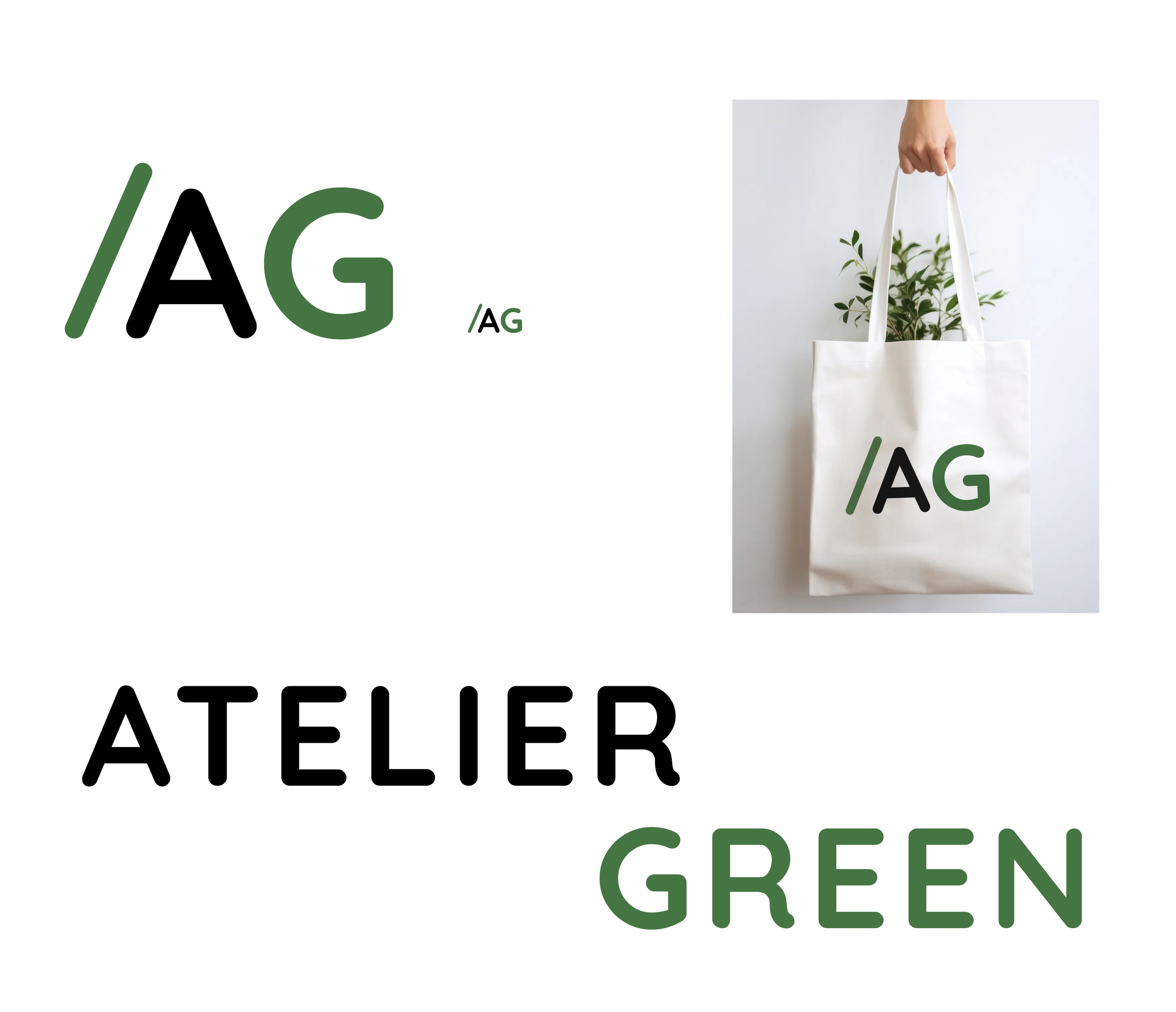
Naming and Logo
For the logo, I explored several directions. I experimented with the original name Pick-a-green, but it felt slightly off-brand—too playful for a mature consultancy focused on sustainability. I then worked with words like green, vert, atelier, bureau, arch, and feuille. Ultimately, I chose Atelier Green because it’s simple, memorable, and carries a subtle French charm while still sounding professional and authoritative.
For the mark itself, I refined the concept down to the initials AG, paired with a parallel slanted green line on the left. This element not only adds a distinctive touch but also evokes the shape of a roof, nodding to the architectural side of the business.
Logo lock uo works well in large and small sizes, will looks great in both small digital formal and large print.
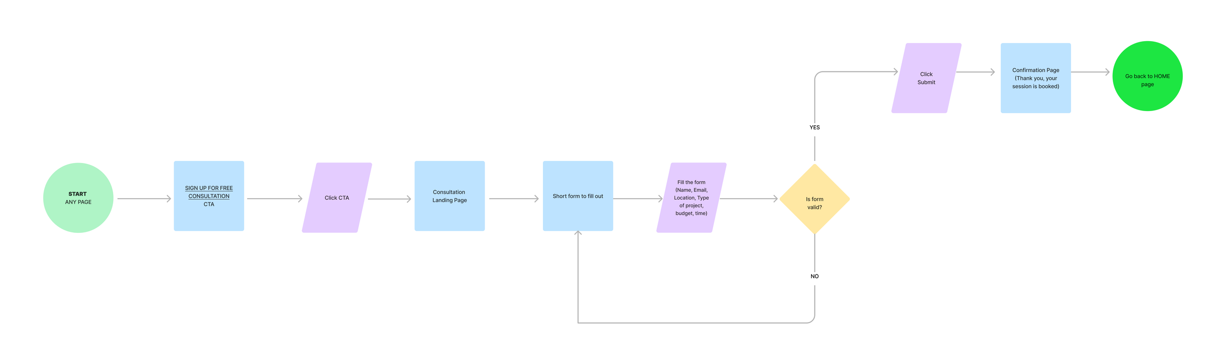
6. Information Architecture & User Flows
Goal: Make the sign-up process simple, clear, and visible.
The final flow includes:
Dedicated consultation page
Short, straightforward form (name, email, location, budget, project type)
Success confirmation
Email notification
6. Information Architecture & User Flows
Goal: Make the sign-up process simple, clear, and visible.
The final flow includes:
Dedicated consultation page
Short, straightforward form (name, email, location, budget, project type)
Success confirmation
Email notification
7. Usability Testing
Participants: 5 users including the business owner
Test Goals:
Assess ability to find and complete the consultation for
Evaluate navigation clarity
Understand impressions of trust and professionalism
Findings
Sign-up Flow
100% of participants successfully completed the task
CTAs described as “impossible to miss”
AG project all pages
Navigation
Clear, intuitive, easy to understand
Service offerings communicated well
AG project all pages
Branding and Aesthetic
Professional, minimal, upscale
Green accent added personality without looking childish
Strong alignment with target Bay Area audience
Areas for Improvement
Add more imagery of family/children’s spaces
Move consultation form to a dedicated page
Update CTA color for consistency
7. Final updates
Based on client and user feedback, I implemented:
Dark green CTAs for visual consistency
Dedicated booking page
Improved button styling
Additional imagery featuring family spaces
Fixed prototype interactions
More engaging CTA language (“Book Now”)
9. Reflection & Learnings
Designing for a small business requires thoughtful communication and clear expectation-setting
Diverse user perspectives help uncover critical insights (even uninterested users were valuable)
Health-focused messaging resonates more deeply than environmental rhetoric
AI-generated imagery, when controlled carefully, can elevate early-stage design presentations
Challenges
Communication delays due to client availability
Ensuring the balance between sophistication and family-friendly warmth
10. Final Deliverables
Brand tile and moodboard
Updated user flows and task flows
Interactive prototype
Visual explorations and page layouts
Full responsive desktop & mobile designs